Explore the uncertainty people face while learning technique, managing setbacks and returning to training.
LiftLab Case Study
A research-led mobile experience for powerlifting, recovery and progression.
Product demoVideo coming next
01 / Context
The project started with a problem I had experienced firsthand.
Powerlifting centres on three lifts: the squat, bench press and deadlift. Its appeal is clear: measurable progress, growing strength and goals to work towards. But learning to lift and navigating setbacks can make that progress difficult to sustain.
When I started powerlifting, I was still learning the fundamentals. Poor posture and technique led to a lower-back injury, interrupting my training. Returning meant stepping back, following structured recovery exercises and gradually rebuilding my routine.
During my MSc UX project, a teammate shared a similar experience. That led me to ask: how could one digital experience help people learn, navigate recovery and return to consistent training?
Investigate how guidance, training structure, progress and community could work together in one place.
Personas · Low-fi concepts · Wireframes · High-fidelity UI · Methodology · Analysis
The Process
02 / Research
Understanding the people behind the lifts.
I wanted to understand what training and recovery looked like for the people behind the sport. Through surveys and interviews, I looked at what kept people from training, what interrupted their progress, where they sought support and which forms of guidance they actually found useful. The findings showed me where to look next.
To understand people’s training and recovery experiences, I conducted surveys and user interviews with my team. I focused the research on four main themes: goals, barriers, support and useful guidance.
Questions centred on:
- What are you working towards in powerlifting, and how do you plan your training and track progress?
- Can you describe a time when pain, injury or another challenge interrupted your training? How did you respond?
- When you’re unsure about technique or returning to training, where do you turn for support, and what remains unclear?
- Tell me about guidance you’ve used, such as videos, training plans or coaching. What made it useful or difficult to follow?
Findings
Increasing strength was the clearest goal among powerlifting respondents.
Joint pain was the most frequently selected challenge in the survey.
Improving technique and preventing injury were both recurring priorities for support.
Video tutorials and personalised training plans were the most preferred guidance formats.
Competitor analysis
What existing products did well, and where they fell short.
I compared adjacent products to understand how they approached coaching, recovery, tracking and motivation. I looked for ideas that could inform LiftLab and gaps they left in a powerlifting journey.

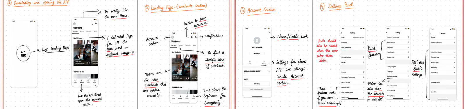
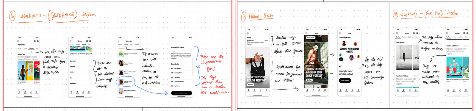
Nike Run Club
Guided running, motivation and progress tracking.
Pros
- Free guided plans: Made structured training easier to start.
- Audio coaching: Offered guidance without constant screen attention.
- Community challenges: Encouraged consistency.
- Wearable pairing and shoe mileage tagging: Connected activity with training history.
Cons
- Running-specific: Without strength-training or recovery workflows.
- Limited plan depth: Less support beyond beginner programmes.
- Reported sync and accuracy issues: Could undermine continuity and trust in progress data.
For LiftLabMake structured training approachable, with guidance that supports the task rather than competing for attention.
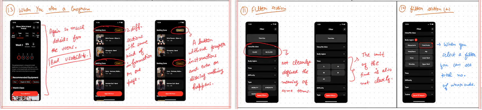
Annotated interface review

Prehab
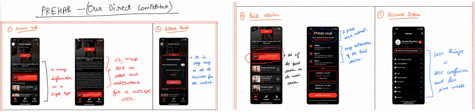
Recovery, injury prevention and personalised rehabilitation.
Pros
- Recovery focus: Prioritised recovery and injury prevention.
- Guided content: A broad tutorial library and personalised plans.
- Progressive-load principles: Provided a structured path back to performance.
- Custom workout builder: Allowed flexible routines.
Cons
- Paid access: Created a barrier for cost-sensitive users.
- Limited progress tracking: Made improvement harder to see.
- Reported reliability concerns: Accuracy concerns, bugs and video-loading issues could interrupt recovery guidance.
For LiftLabConnect clear recovery guidance with visible progress and a practical route back to training.
Annotated interface review

Strava
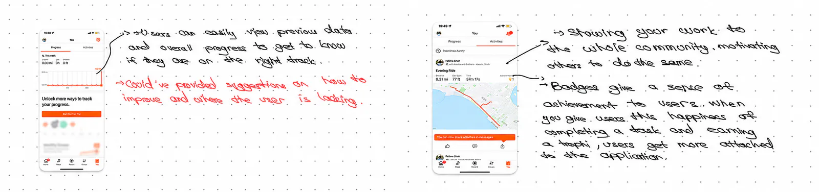
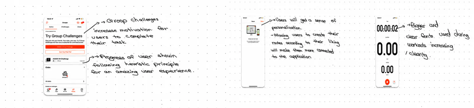
Activity analytics, live tracking and social fitness.
Pros
- Analytics and live tracking: Made performance visible.
- Device syncing: Reduced manual activity logging.
- Community and challenges: Turned progress into a shared experience.
- Fatigue and freshness tracking: Supported training-load planning.
Cons
- Not lifting-focused: Core activity metrics did not explain technique, sets or recovery.
- Access friction: Subscription barriers and desktop-only features added friction.
- Privacy and tracking concerns: Could reduce confidence in sharing and interpreting data.
For LiftLabMake lifting progress meaningful, and use community to support motivation without replacing training guidance.
Annotated interface review
Emerging problem areas
Four problem areas emerged.
I compared the survey and interview findings with observations, secondary research and the competitor review. Affinity mapping revealed four recurring challenges:
Recovery uncertainty
Injury, joint pain and slow recovery made the next step unclear.
Technique guidance
Beginners wanted structured support without relying entirely on a trainer.
Consistency
Fatigue, disrupted routines and low motivation interrupted progress.
Fragmented support
Training, recovery, progress and community lived in separate places.
Defined problem
Powerlifters, especially beginners and those returning from injury, lacked a dedicated place that connected recovery guidance, technique, structured training and progress.
03 / Synthesis
One persona, shaped by the research.
I combined the recurring goals, behaviours and pain points from five research perspectives into one composite persona. Lisa represented the patterns shared across the research, rather than any one participant.
Composite persona
Lisa
Lisa is 23 y.o. and moved from Spain to London for a master’s in design at King’s College London. Her friends back home inspired her to try powerlifting. She liked having a goal to work towards and seeing her strength improve, but a back injury interrupted her training. Now she is trying to make sense of recovery advice and find appropriate support. She hopes to return to exercise gradually when she is ready, without feeling as though she has to figure out every step alone.
Needs
Lisa needs recovery information she can understand, appropriate support for making a plan, and a clearer path back to exercise when she is ready. As she returns, she wants technique guidance and a way to see her progress.
Pain points
The injury has interrupted the progress that motivated her. Advice is scattered across different sources, so she struggles to tell what is relevant to her situation. She also worries about doing too much too soon, while regular one-to-one coaching may be difficult to afford.
Goals
- Understand her recovery options
- Return to exercise gradually
- Rebuild strength and confidence
- See progress over time
Behaviours
- Searches for recovery advice
- Compares guidance from different sources
- Prefers a structured plan
- Tracks her training progress
Lisa combines recurring research patterns; she does not represent one person’s exact experience.
User journey
The more Lisa searches, the harder it feels to begin again.
After her injury, Lisa wants to understand her recovery options and eventually return to lifting. She moves between video tutorials, recovery articles, community discussions and workout apps, hoping to find a plan that connects them. Each source answers a different part of her question, and the fragmented search gradually wears down her confidence.
Motivated
Her friends inspire her to lift, and early progress keeps her engaged.
Video platforms
After the injury, she watches recovery and exercise videos but finds conflicting advice.
Articles & forums
She reads more perspectives, yet cannot tell what applies to her situation.
Workout apps
Plans help her track training, but do not connect clearly to her recovery questions.
Steps back
Sorting through it all feels exhausting, so she pauses her return to lifting.
Lisa has not lost interest in lifting. She has lost confidence in piecing together a route back from disconnected sources.
04 / Ideation
Turning Lisa’s fragmented search into a connected product.
Lisa moved between videos, articles, community discussions and workout apps, but each source addressed only one part of her situation. Another isolated source of advice would not help. She needed recovery information, training guidance, visible progress and support to connect.
How might LiftLab connect the guidance Lisa was already searching for, without making her piece the journey together alone?
Understand recovery→Plan training→See progress→Find support
Card sorting
I grouped the opportunity into four feature areas.
I used card sorting to organise the ideas around Lisa’s needs and the wider research patterns. Four groups emerged: recovery, training, progress and community. These groups helped me decide which features to take forward.
- Recovery plans
- Rehabilitation exercises
- Training plans
- Technique guidance
- PR tracking
- Reminders and rewards
- Groups
- Shared progress
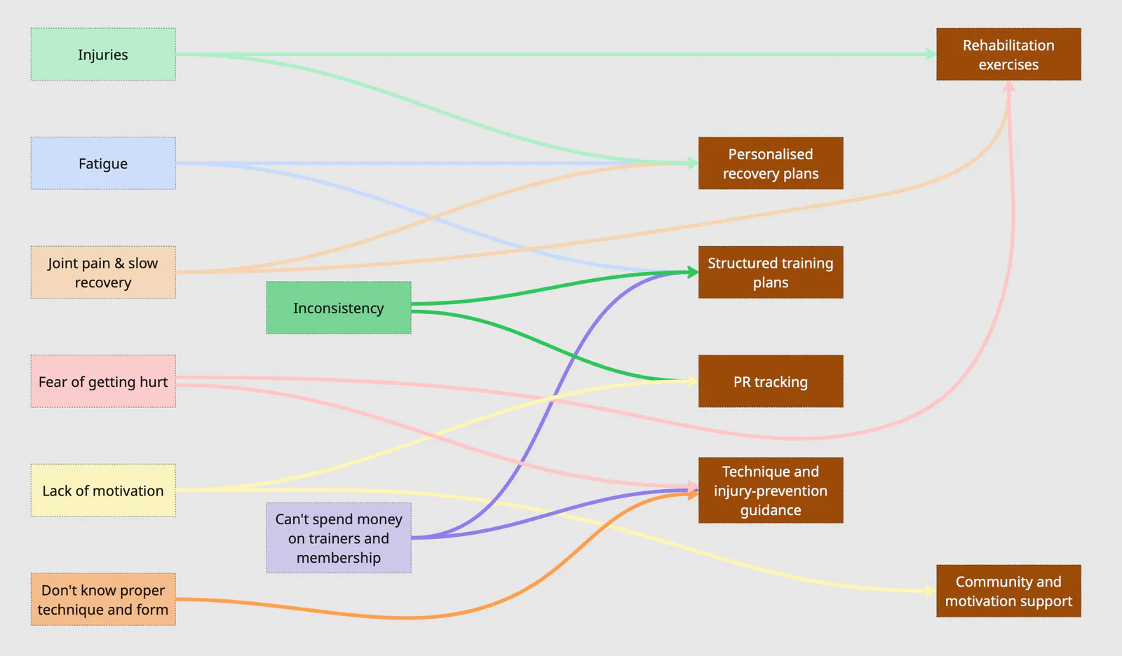
Pain point to feature mapping
Research and card sorting shaped a focused feature set for Lisa.
I compared Lisa’s needs with the wider research patterns, then used the card-sorting groups to choose which ideas to develop. The final set covered recovery, safer training, visible progress and motivation. The mapping below links each feature back to the pain point it addresses.
Ideation
Information Architecture
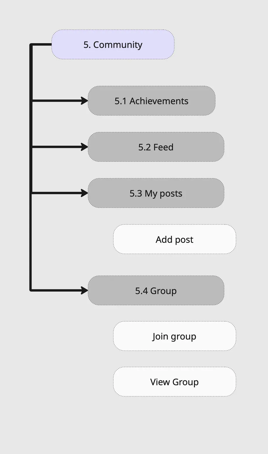
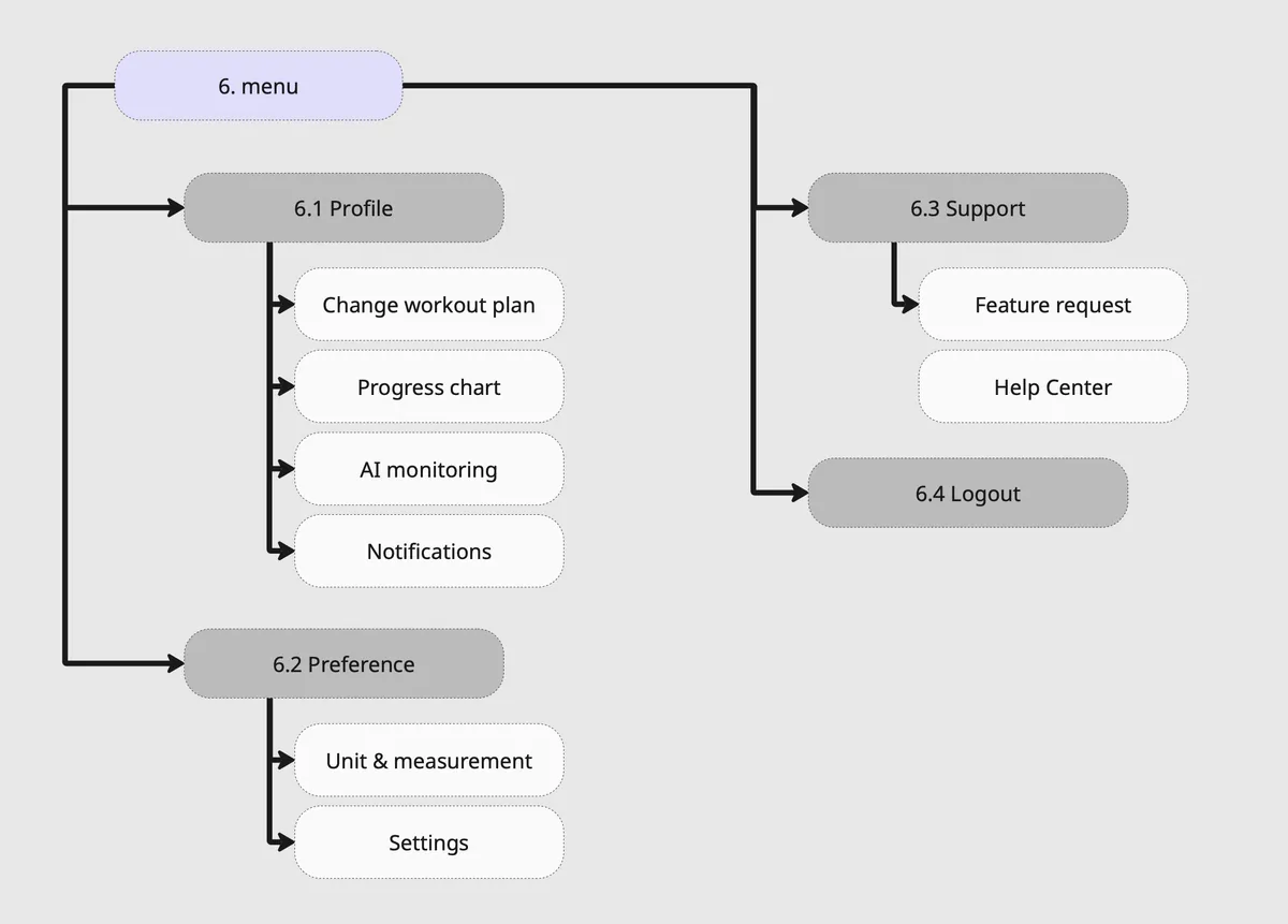
I organised LiftLab into six main areas: Onboarding, Home, Recovery, Workout, Community and Menu/Profile. This showed where each screen, function and piece of information would live.
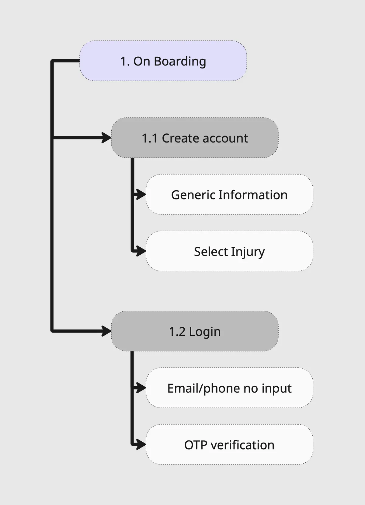
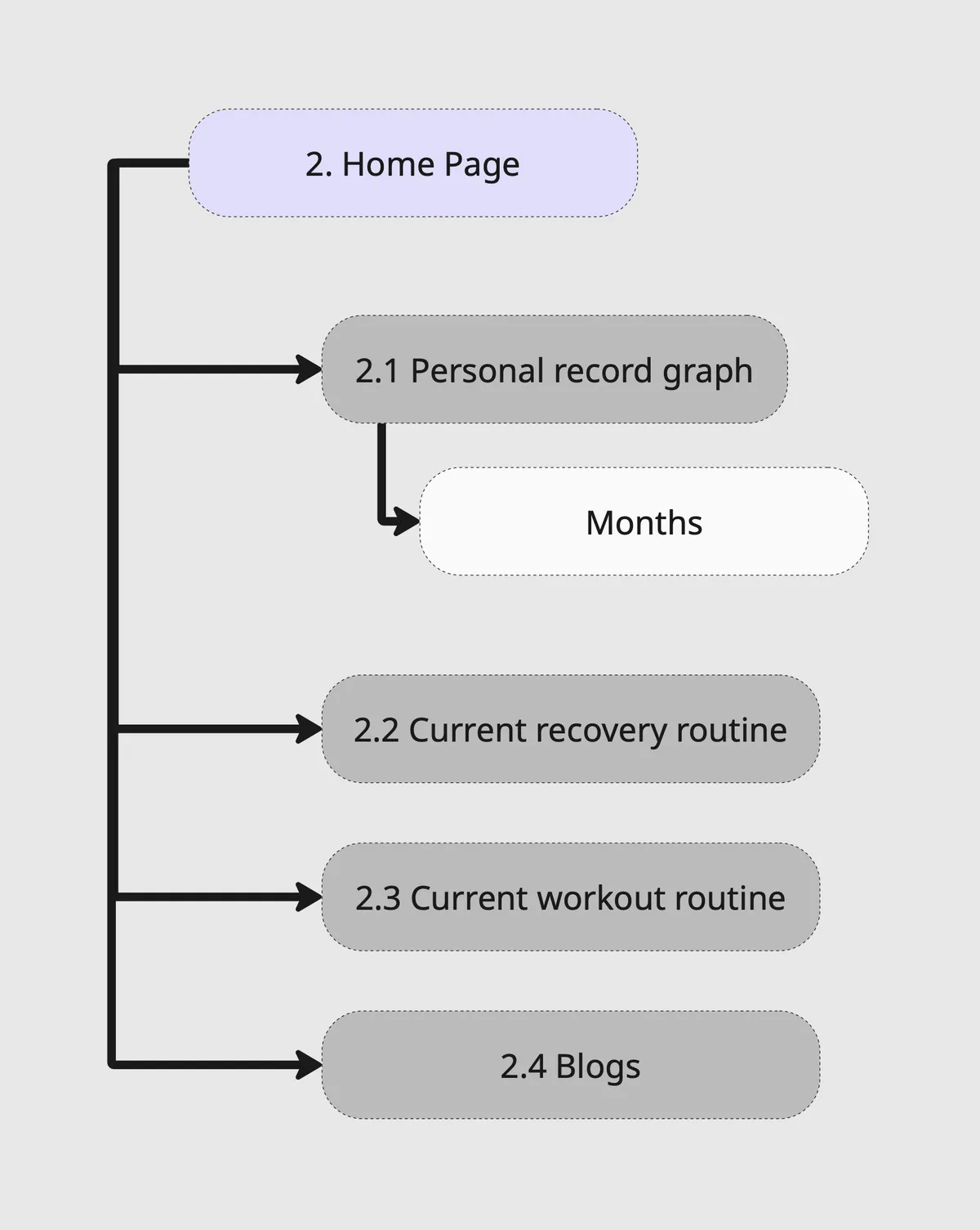
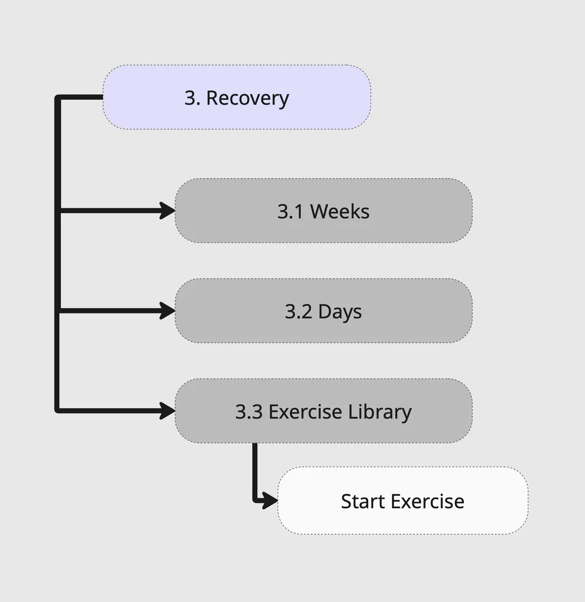
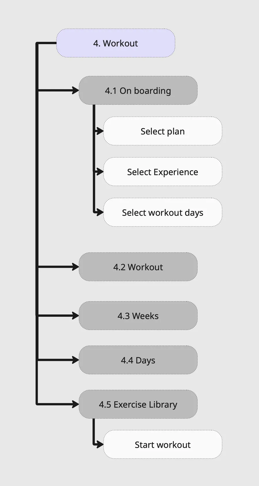
Ideation
User Flows
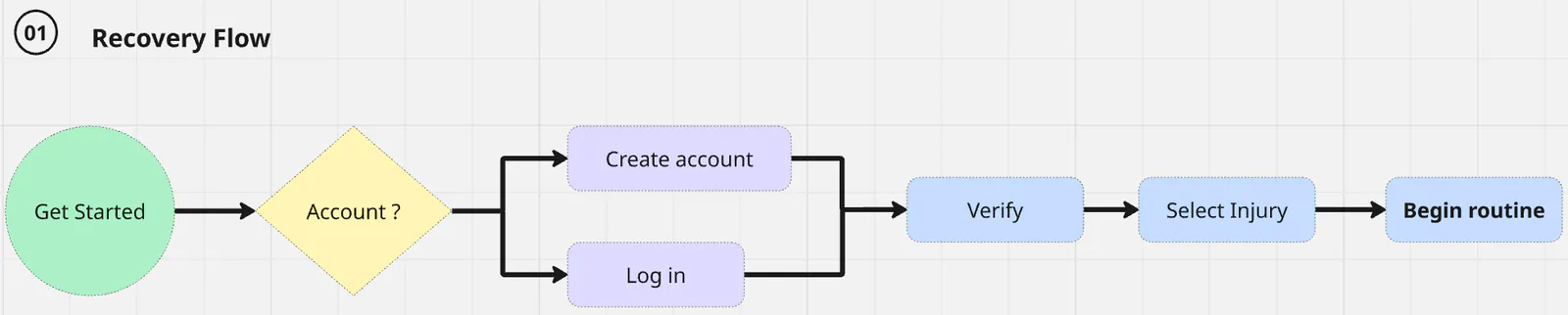
I mapped the paths users could take through LiftLab, including the decisions and alternative routes they might encounter while starting recovery, planning a workout or joining the community.


Ideation
From Sketches to Low-Fidelity Wireframes
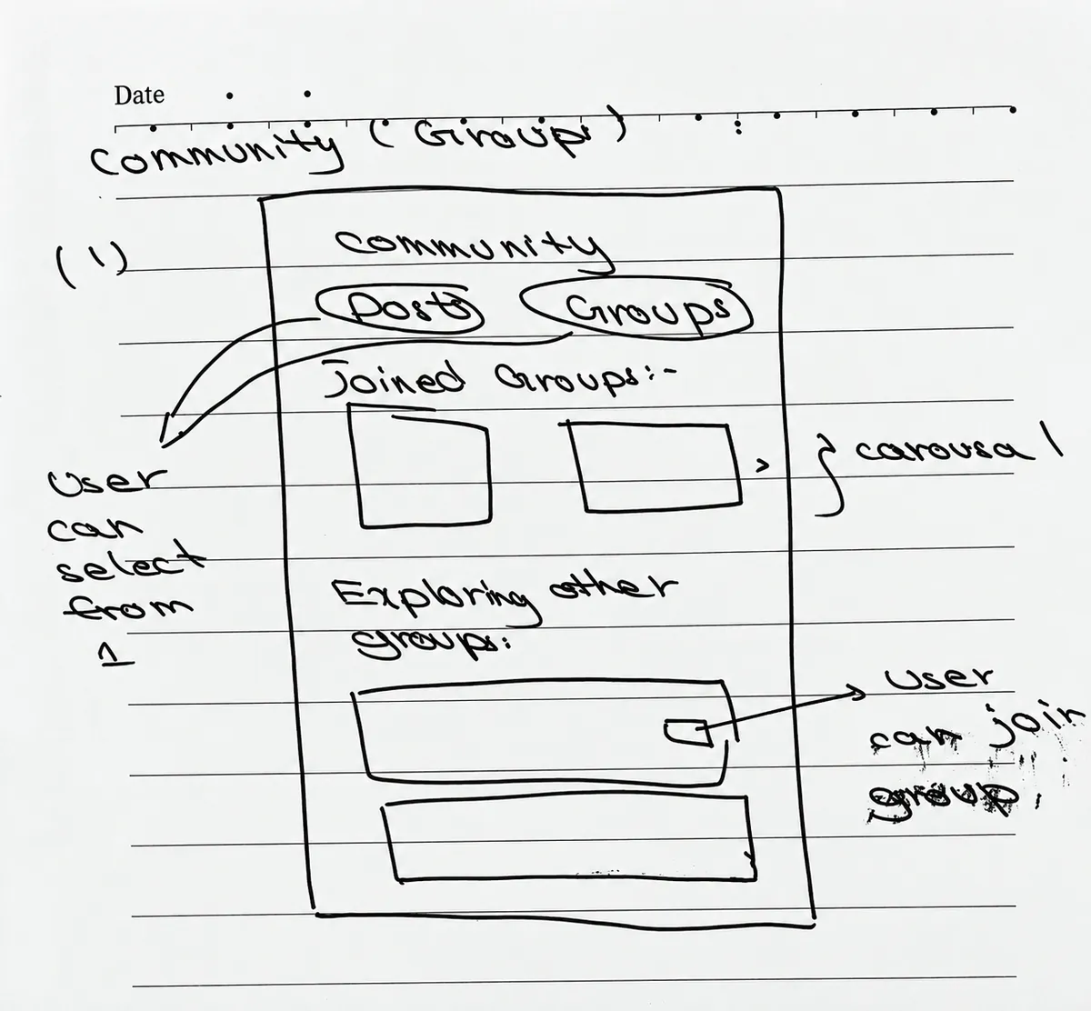
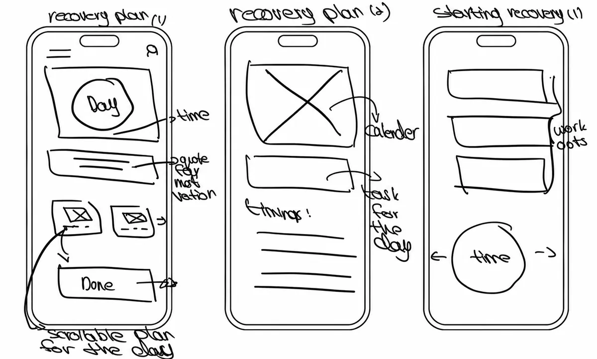
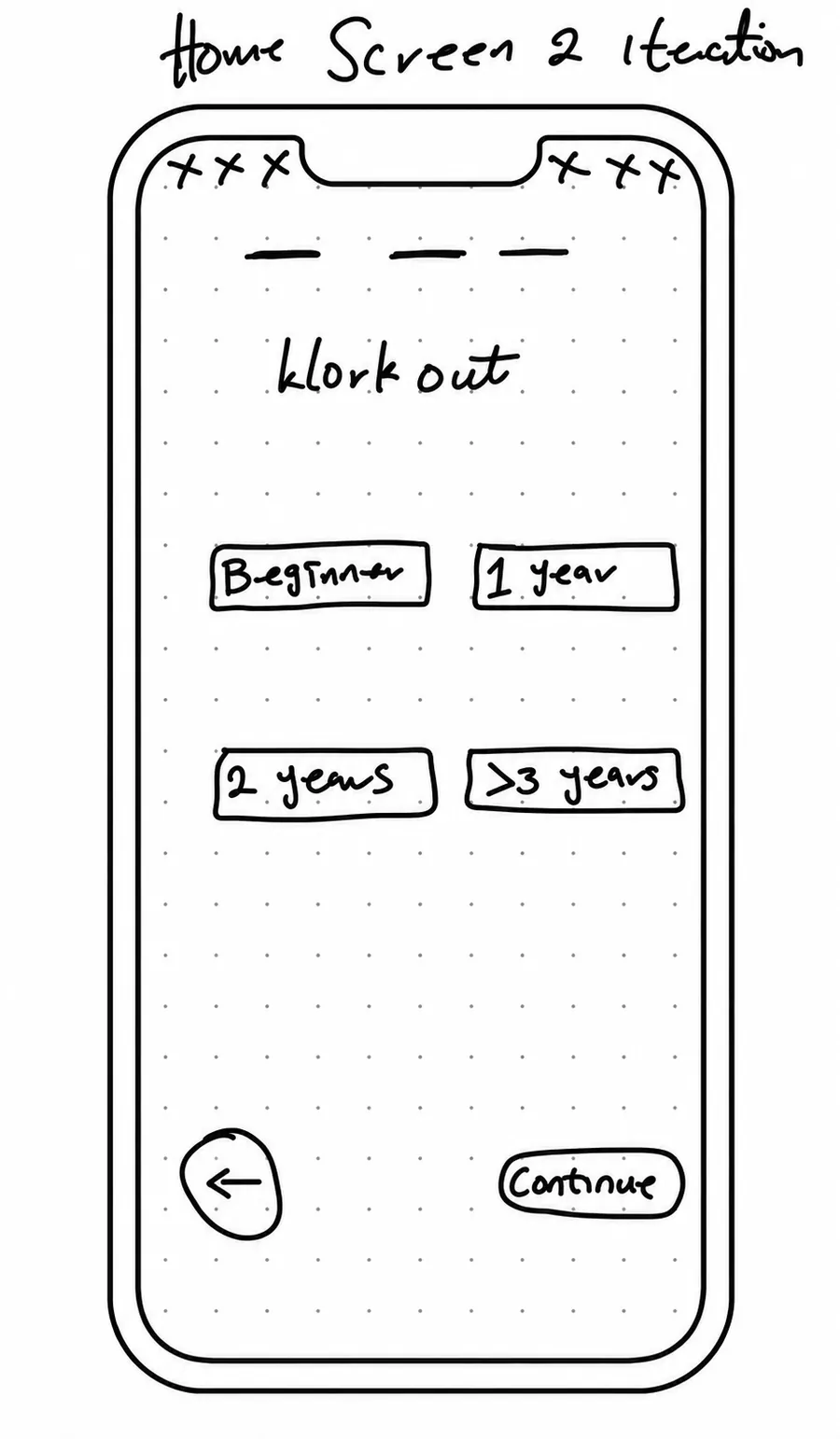
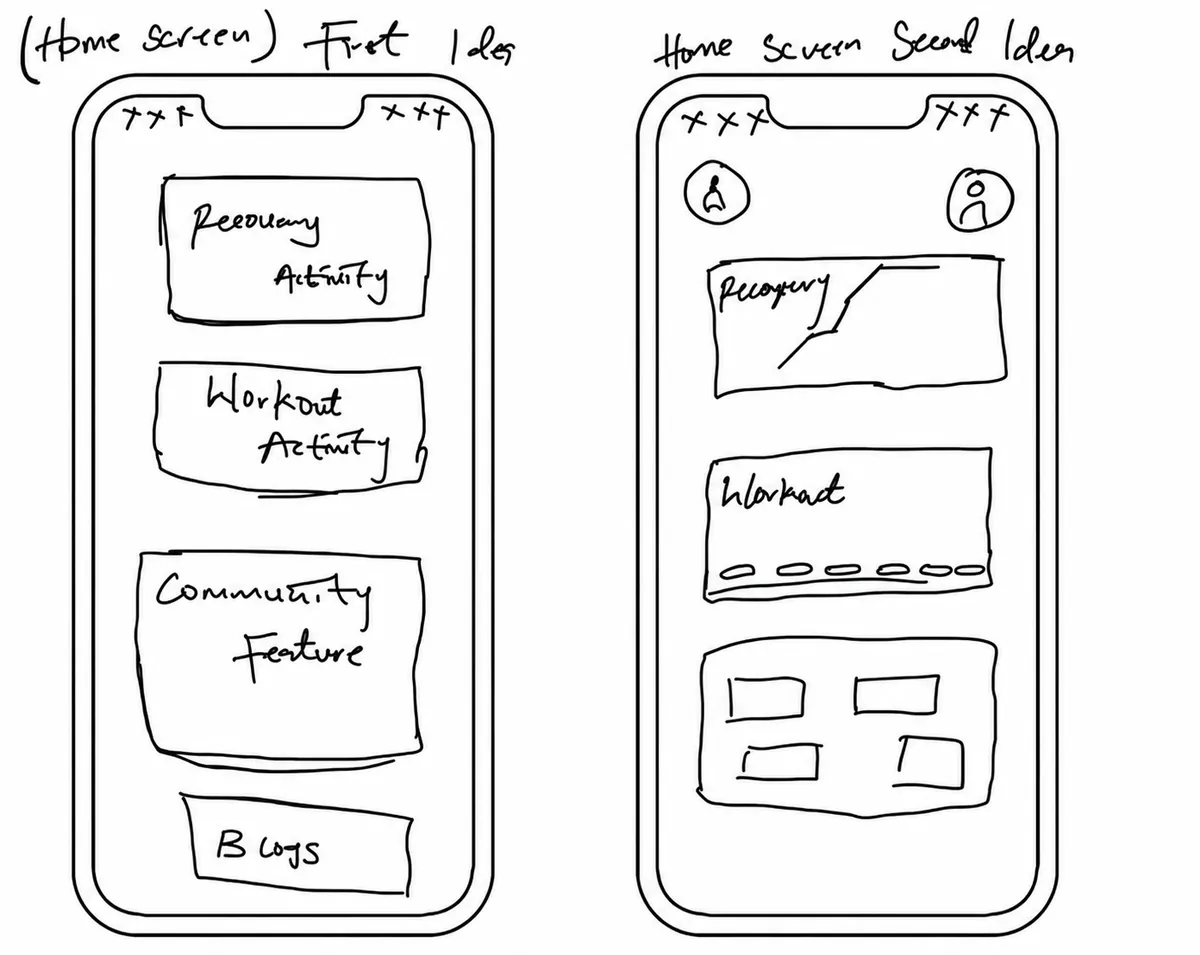
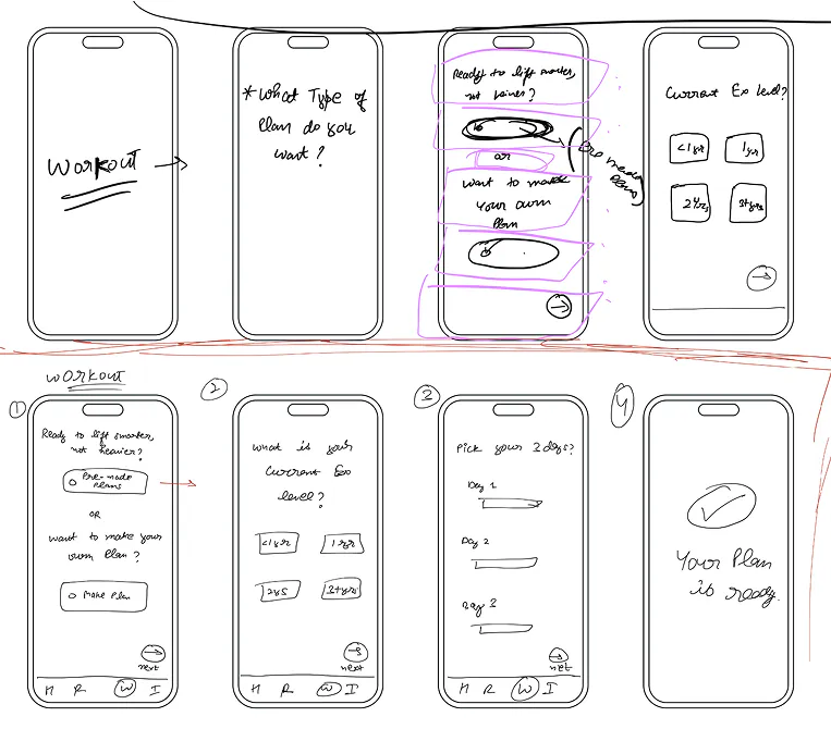
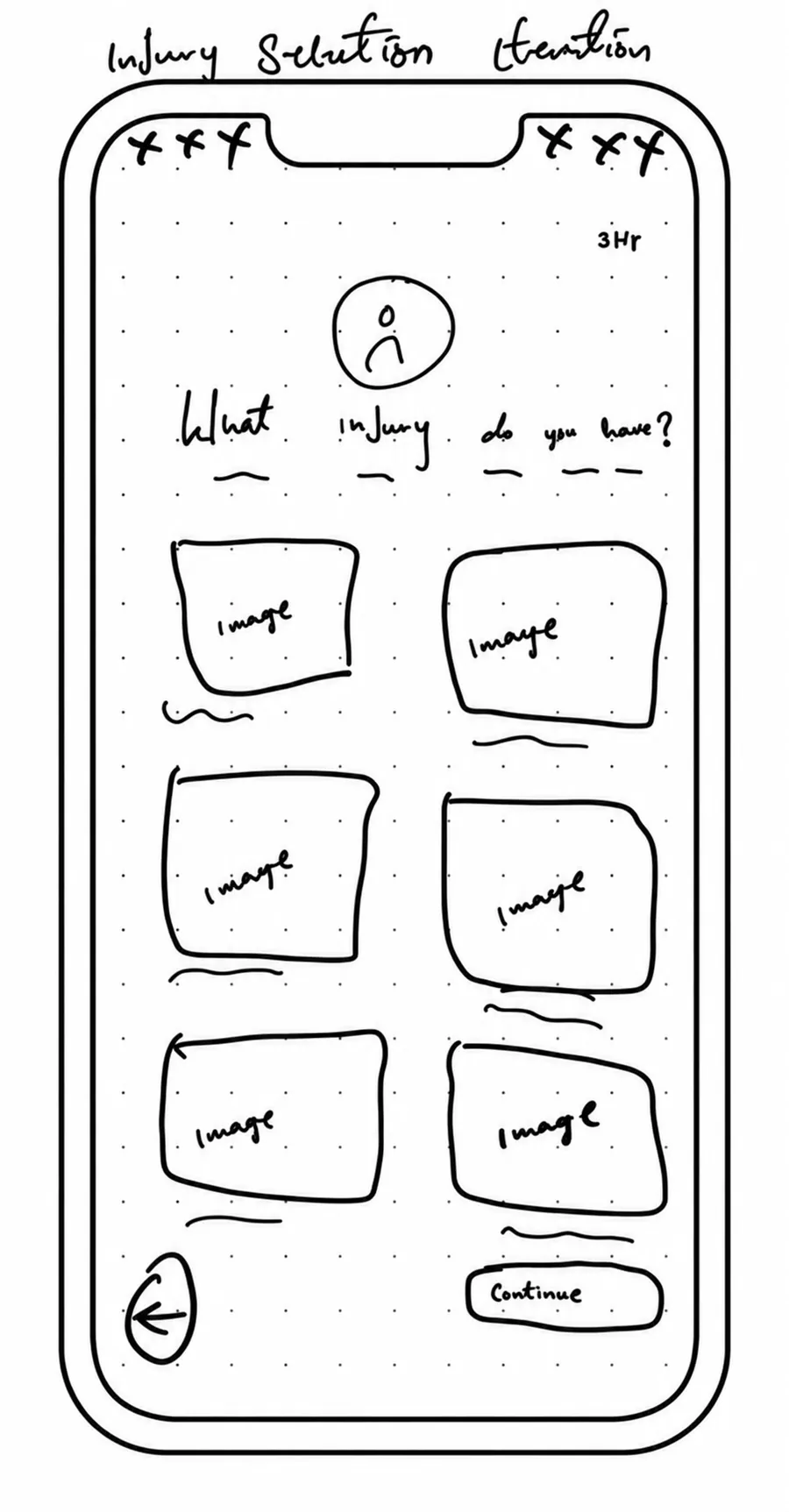
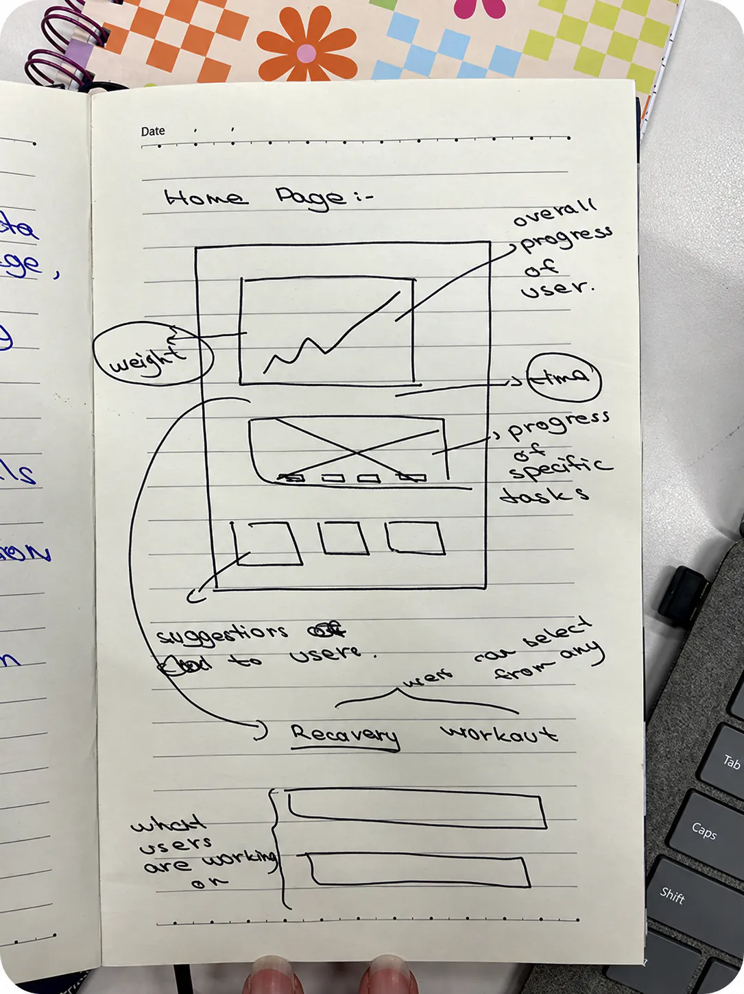
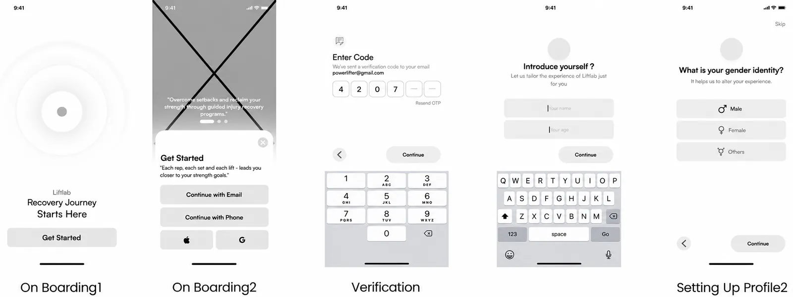
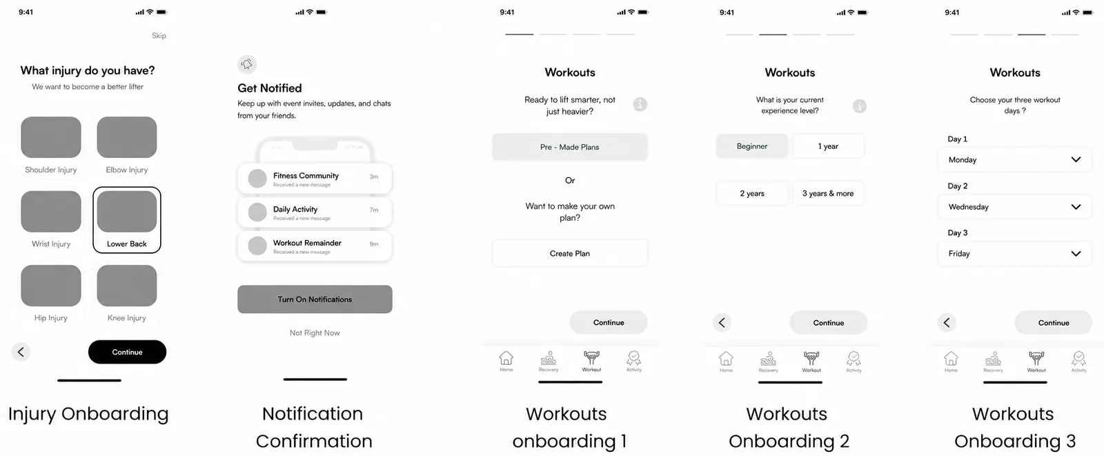
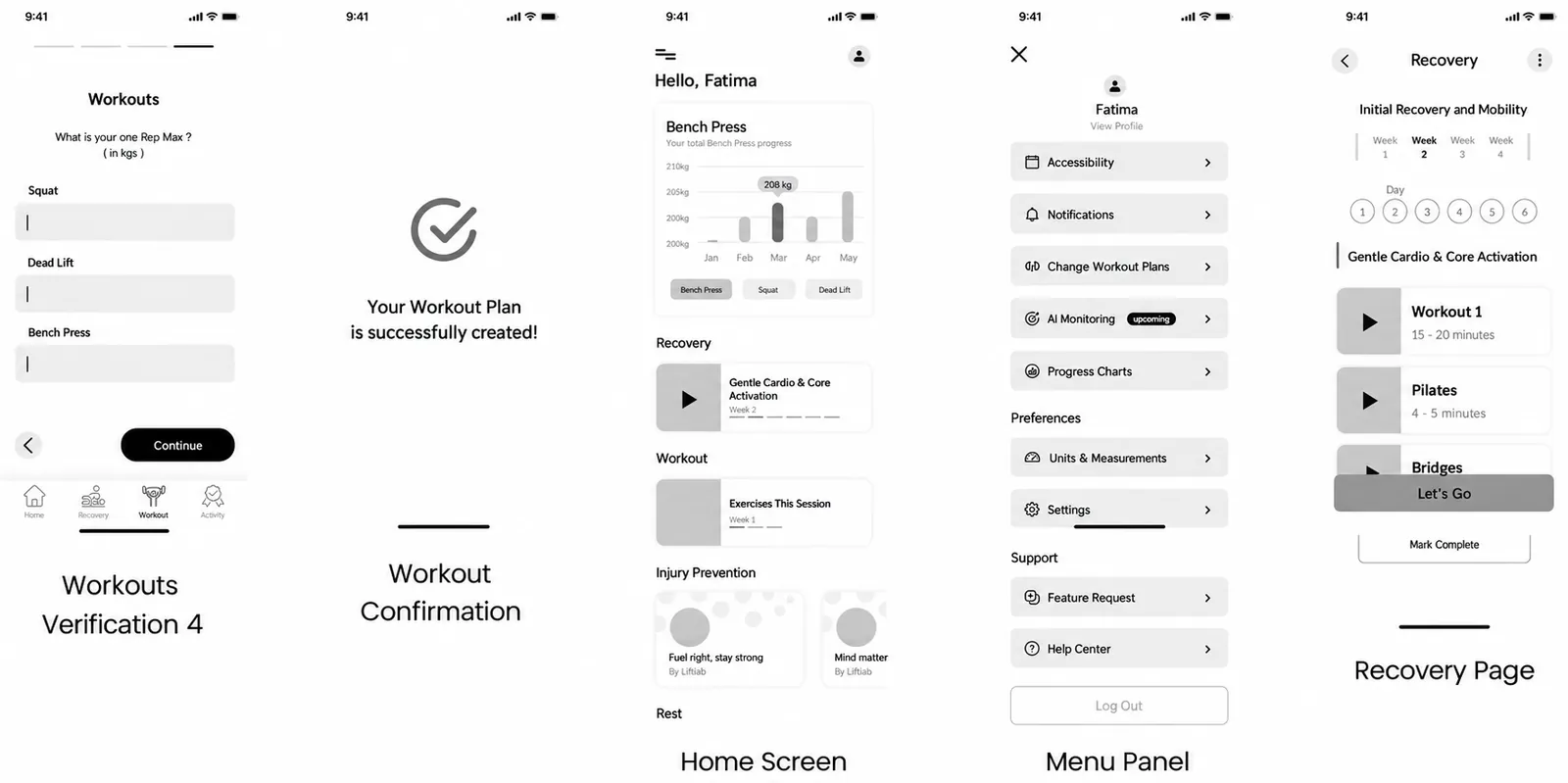
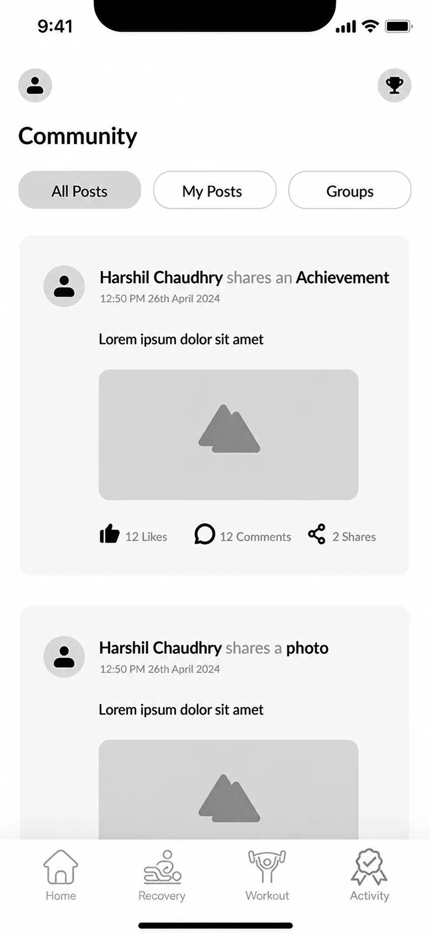
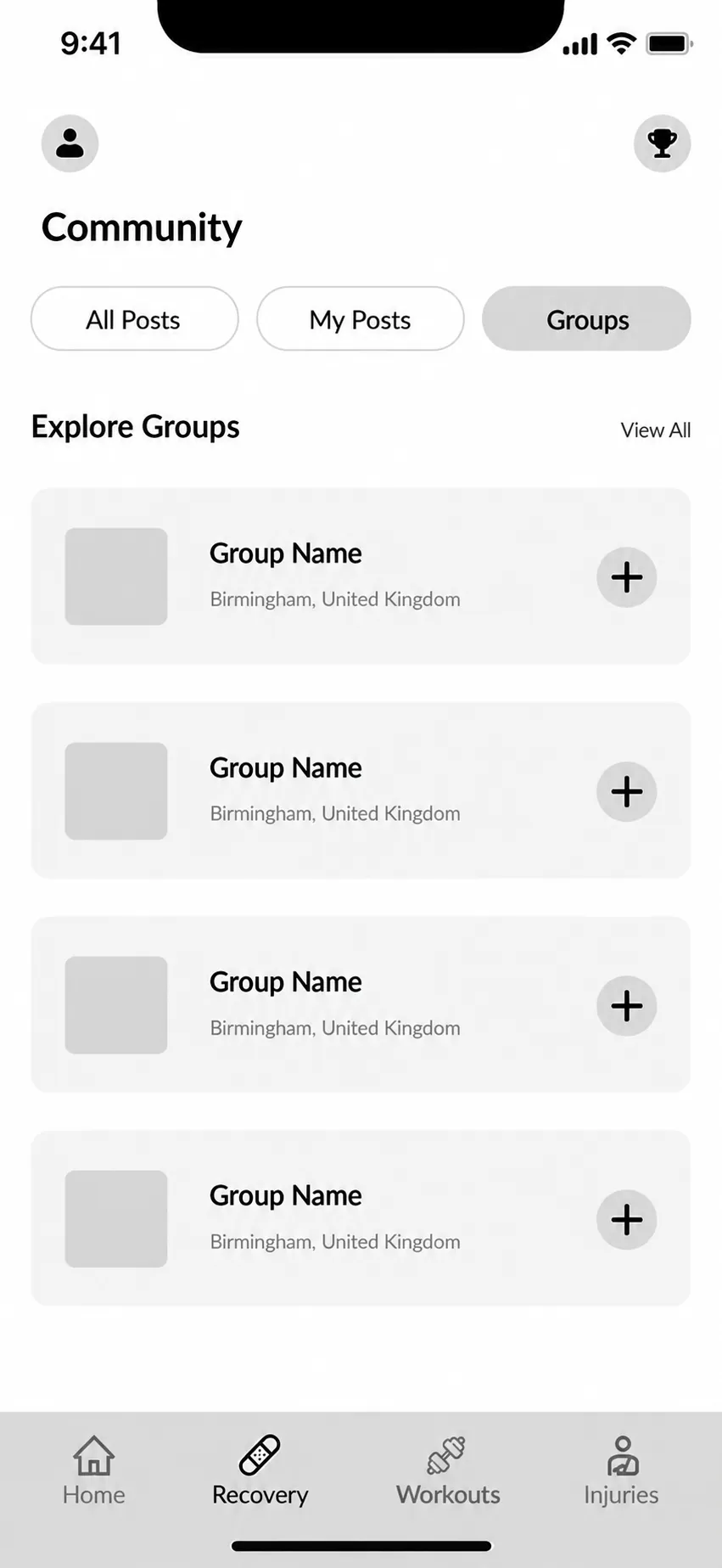
Once the information architecture and user flows were in place, I explored the first screens on paper and then translated them into low-fidelity wireframes. The images below are a selection from each stage, rather than every screen I produced.
01 / Sketches
Exploring the structure on paper.
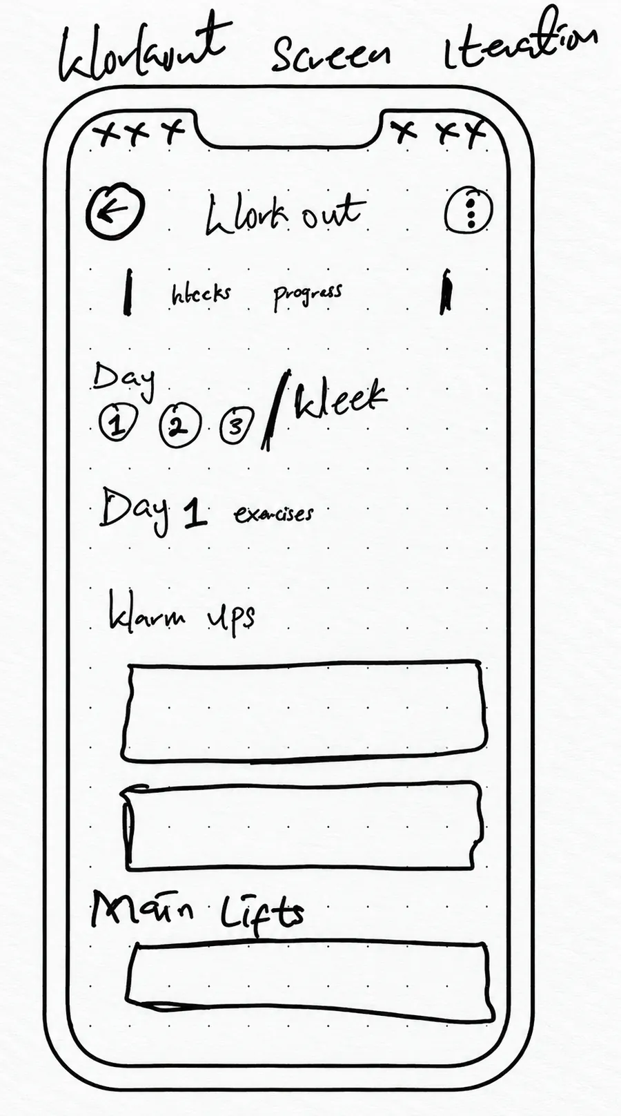
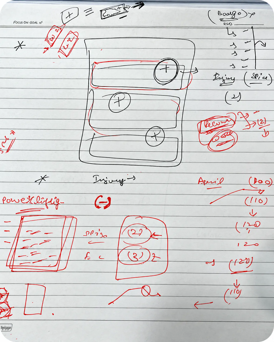
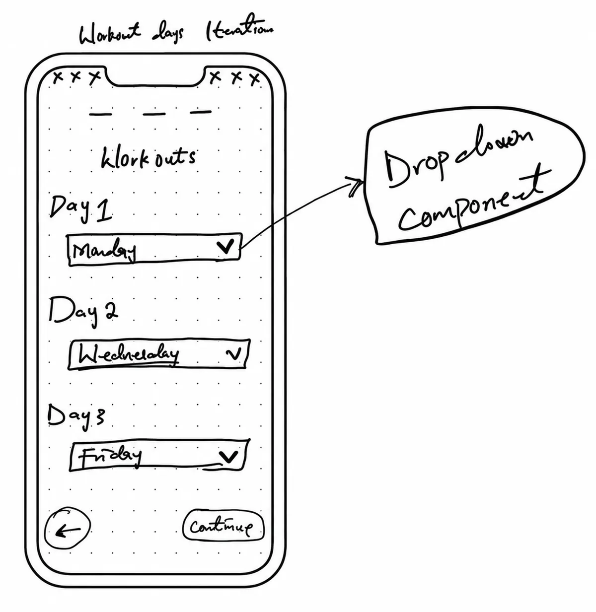
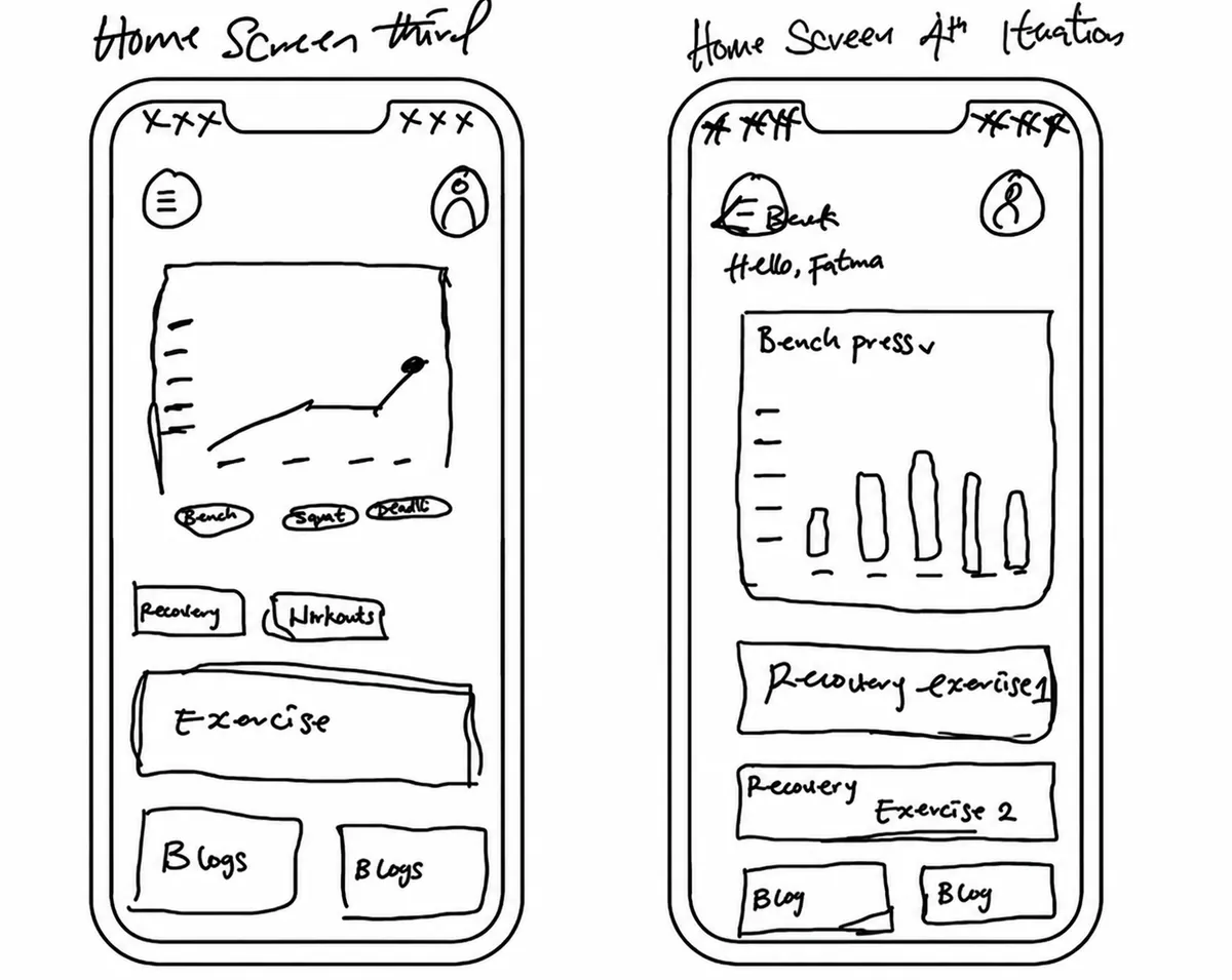
Quick sketches helped compare layouts, navigation patterns and the sequence of key tasks before the screens became more defined.
02 / Early iterations
Three sketching rounds shaped the direction.
Before moving into low fidelity, I revisited the sketches three times. I explored the structure, compared alternatives and consolidated the strongest direction.
01
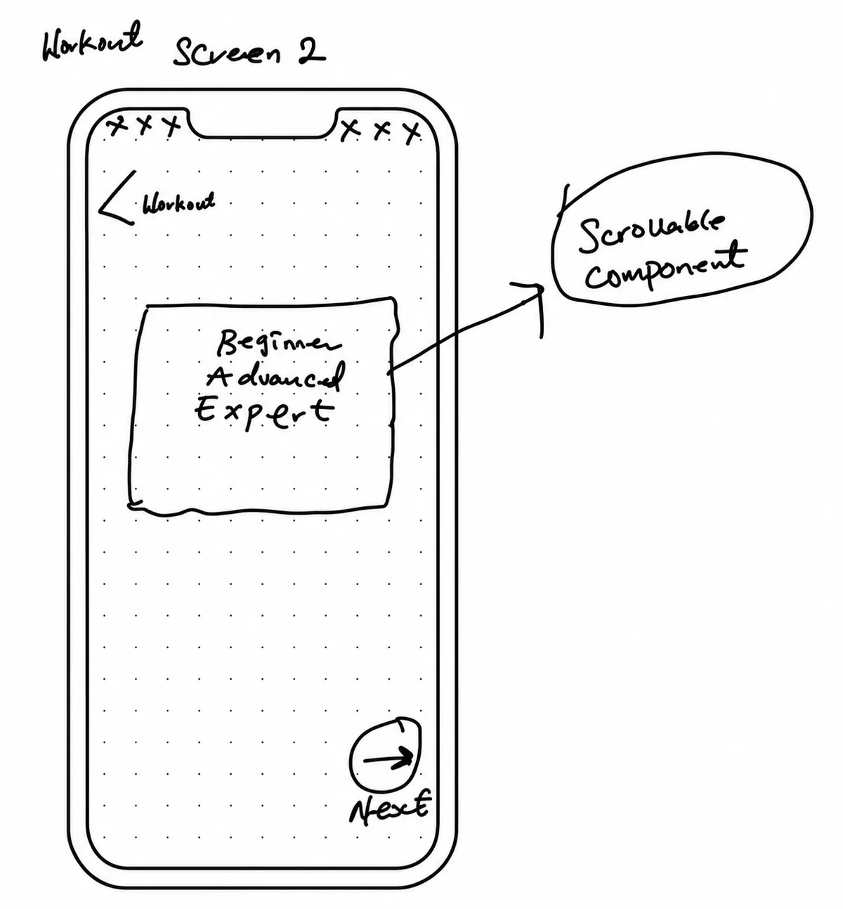
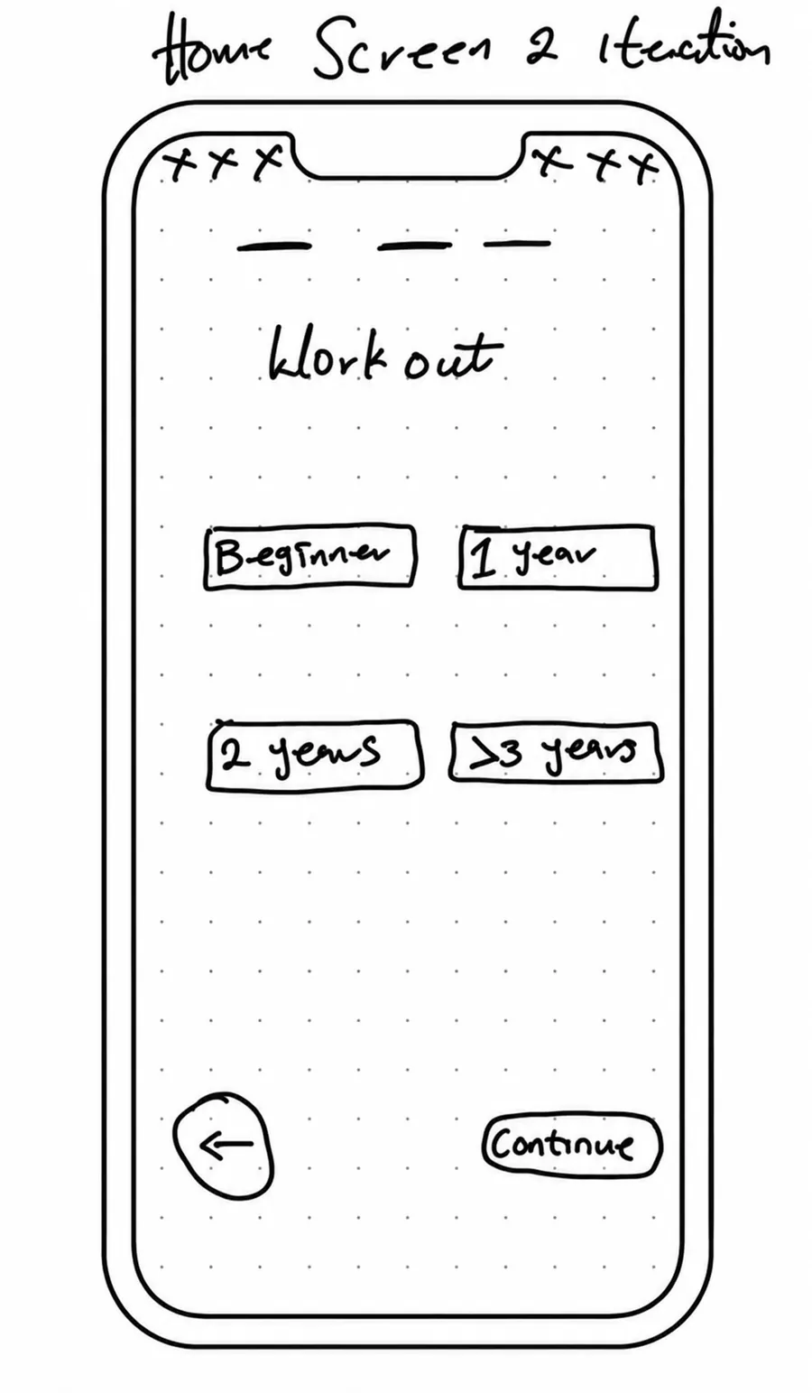
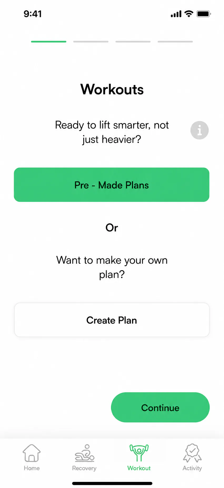
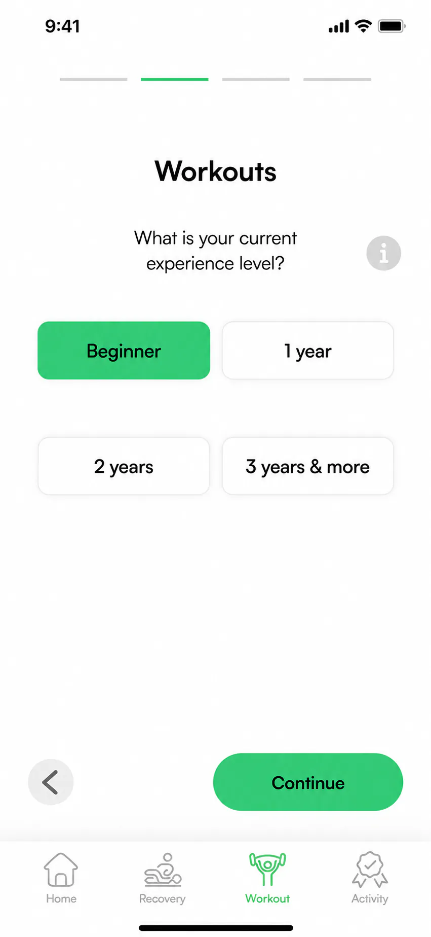
Make experience choices visible
The scrollable experience selector hid a small set of choices. The next version displayed all four options together and described experience through time, making the choice easier to compare.
02
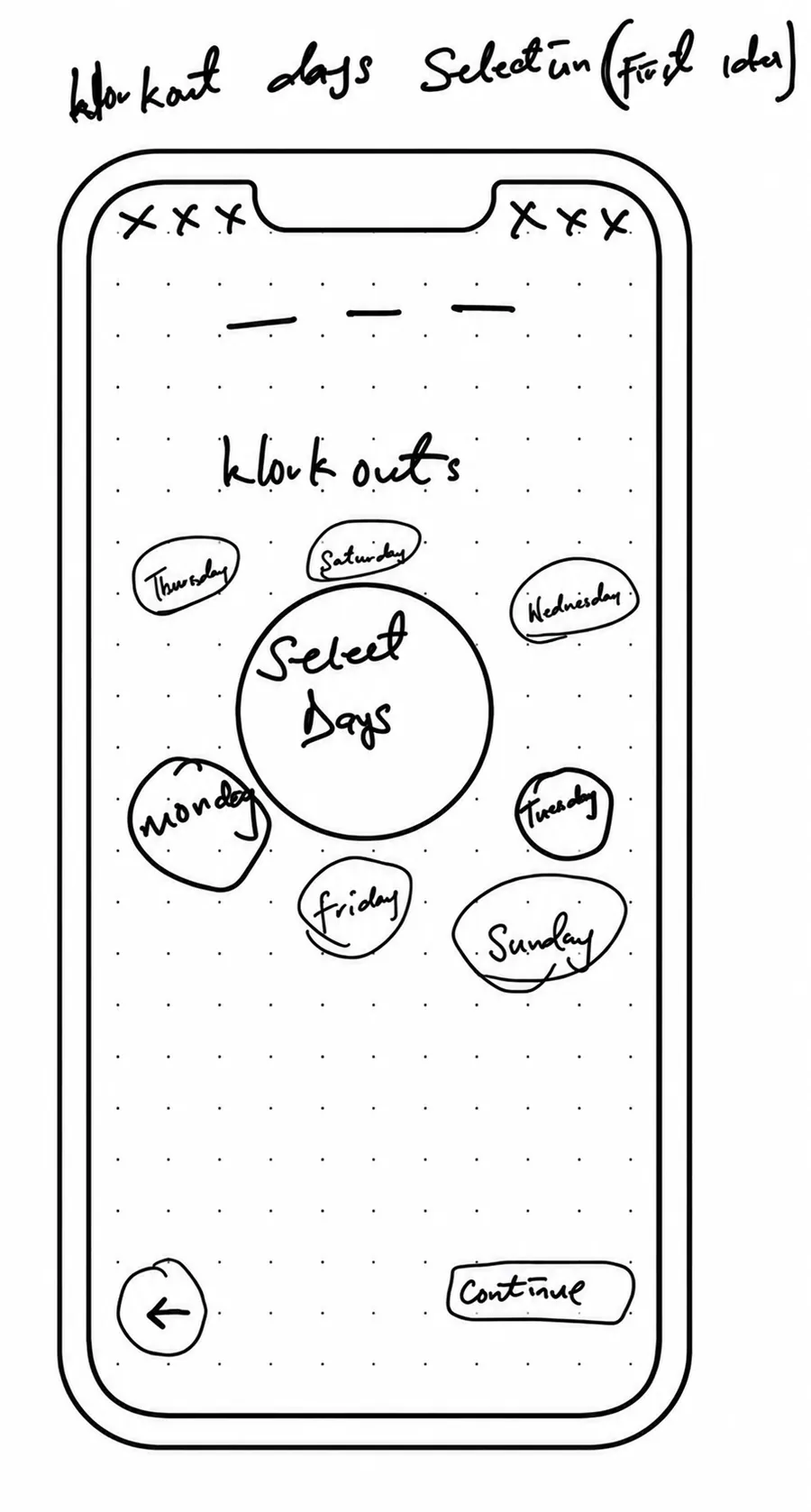
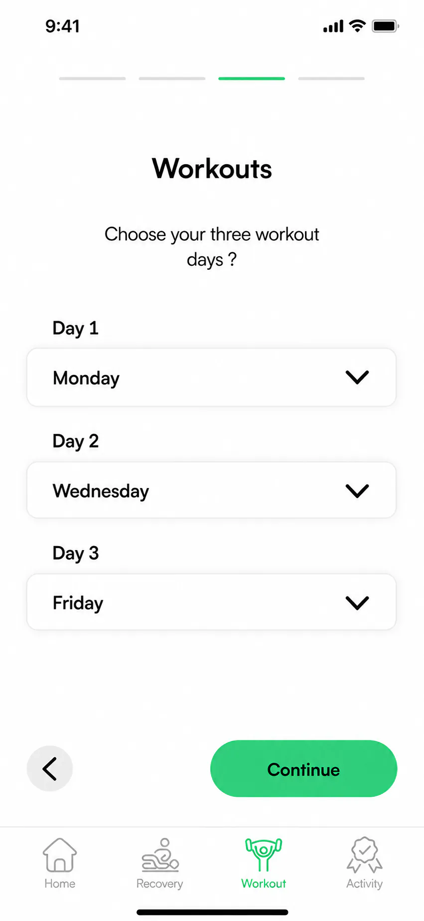
Simplify workout-day selection
The first concept used an Apple Watch-inspired arrangement of days. It was replaced with three clear dropdown fields, making the selected schedule easier to read and change.
03
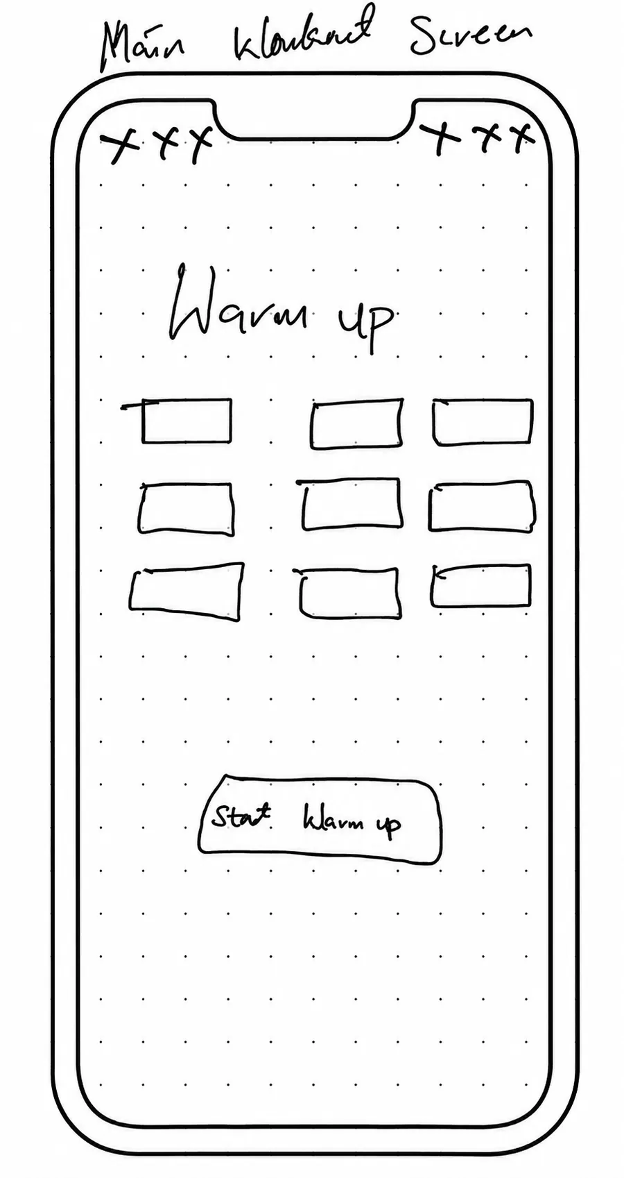
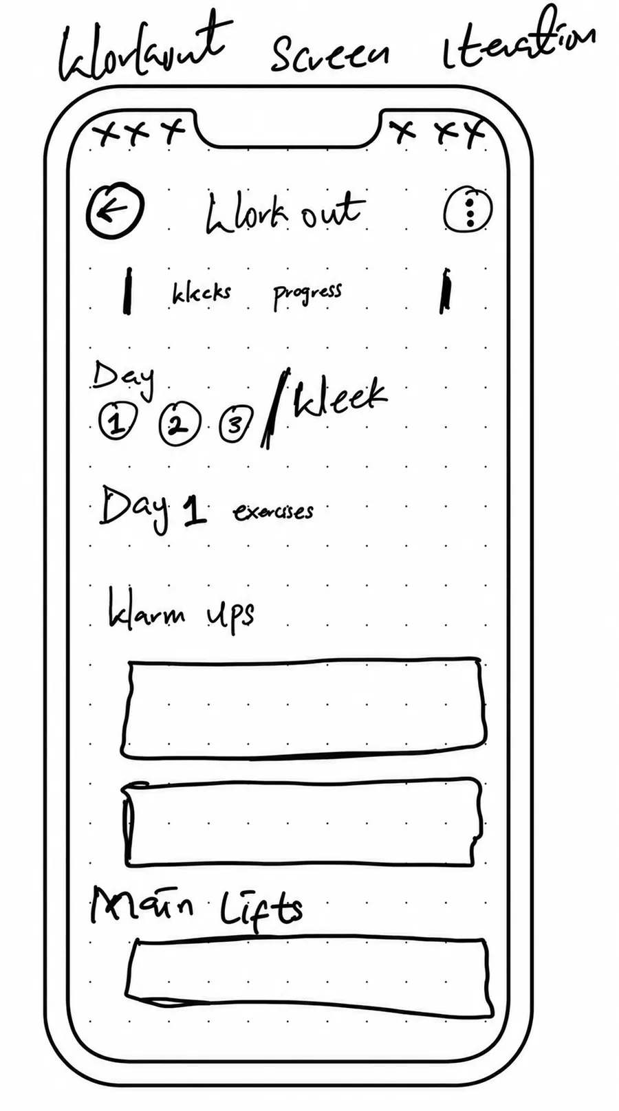
Bring the workout into one view
Warm-ups and other workout elements initially sat on separate screens. The revised overview brought warm-ups and main lifts together to reduce unnecessary navigation and improve readability.
03 / Low fidelity
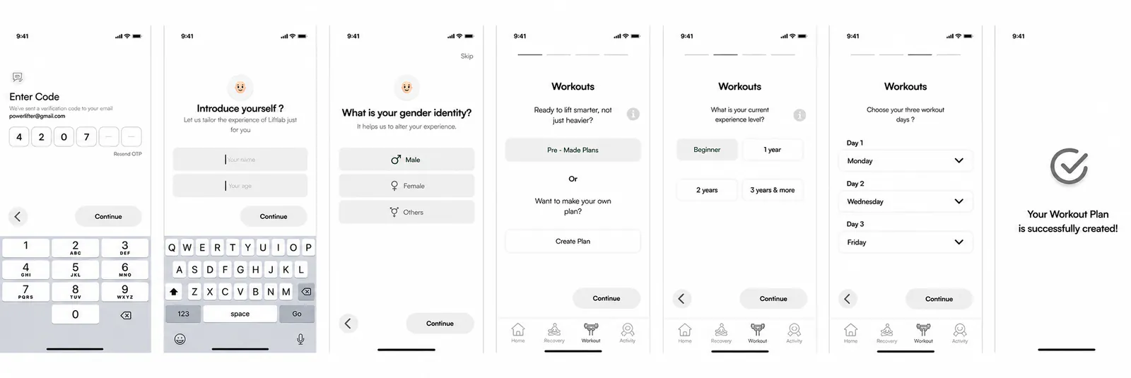
Turning the sketches into testable screens.
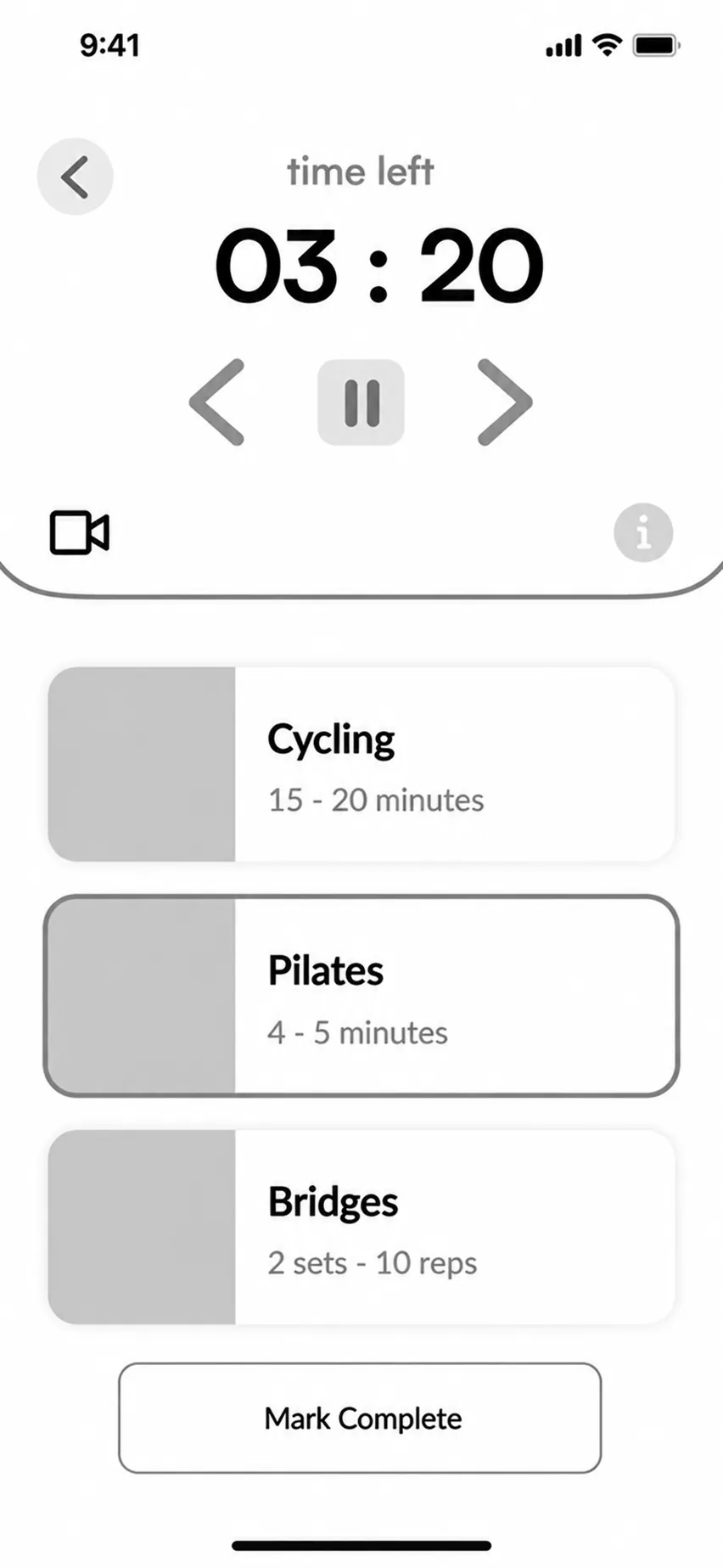
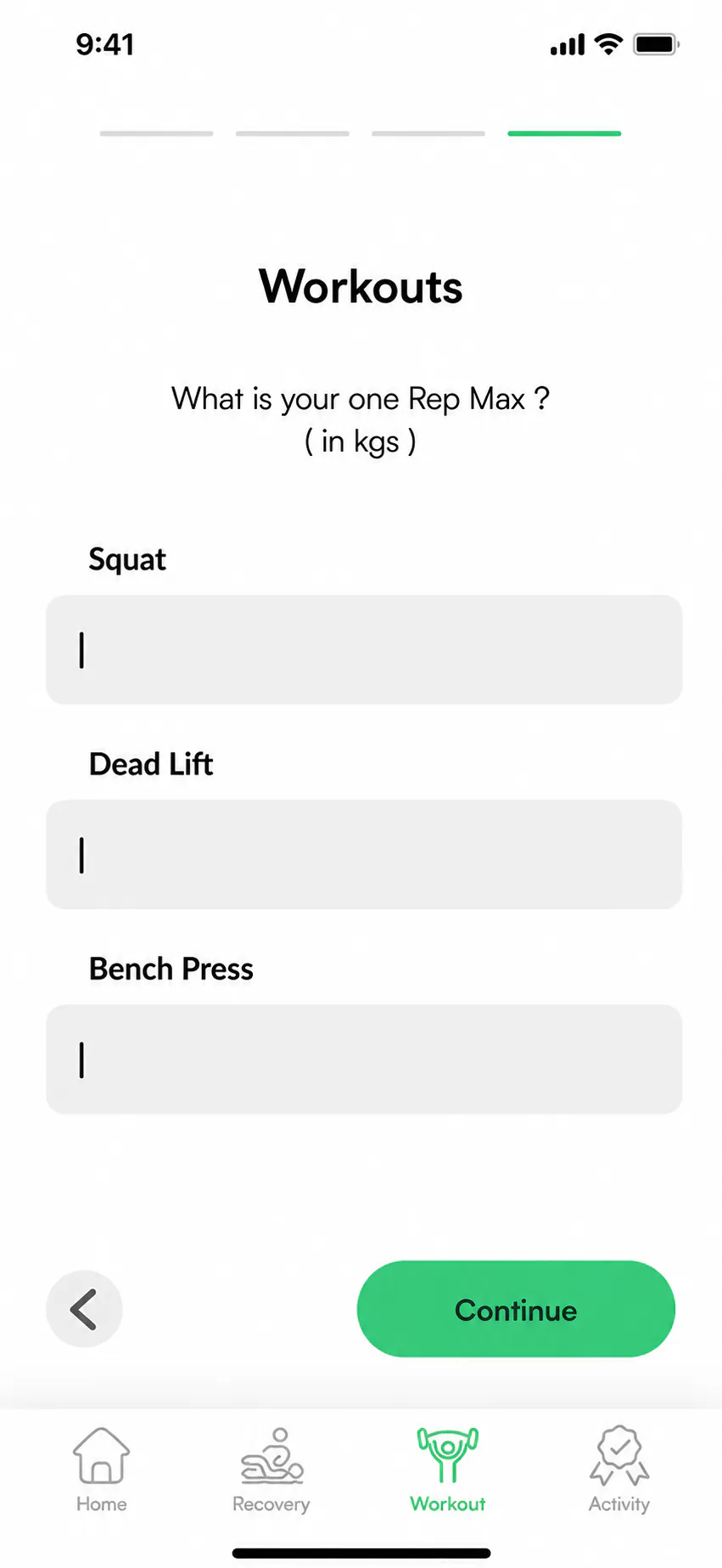
The selected low-fidelity wireframes show how the strongest ideas were translated into clearer screen hierarchy, navigation and task sequences.
05 / Design development
From a tested structure to one connected interface.
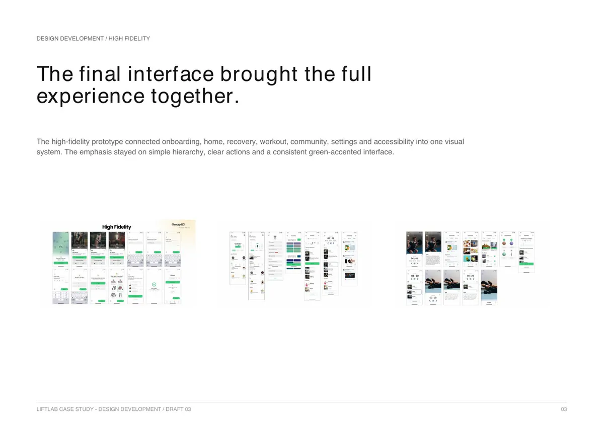
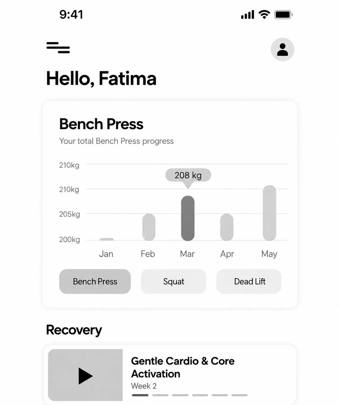
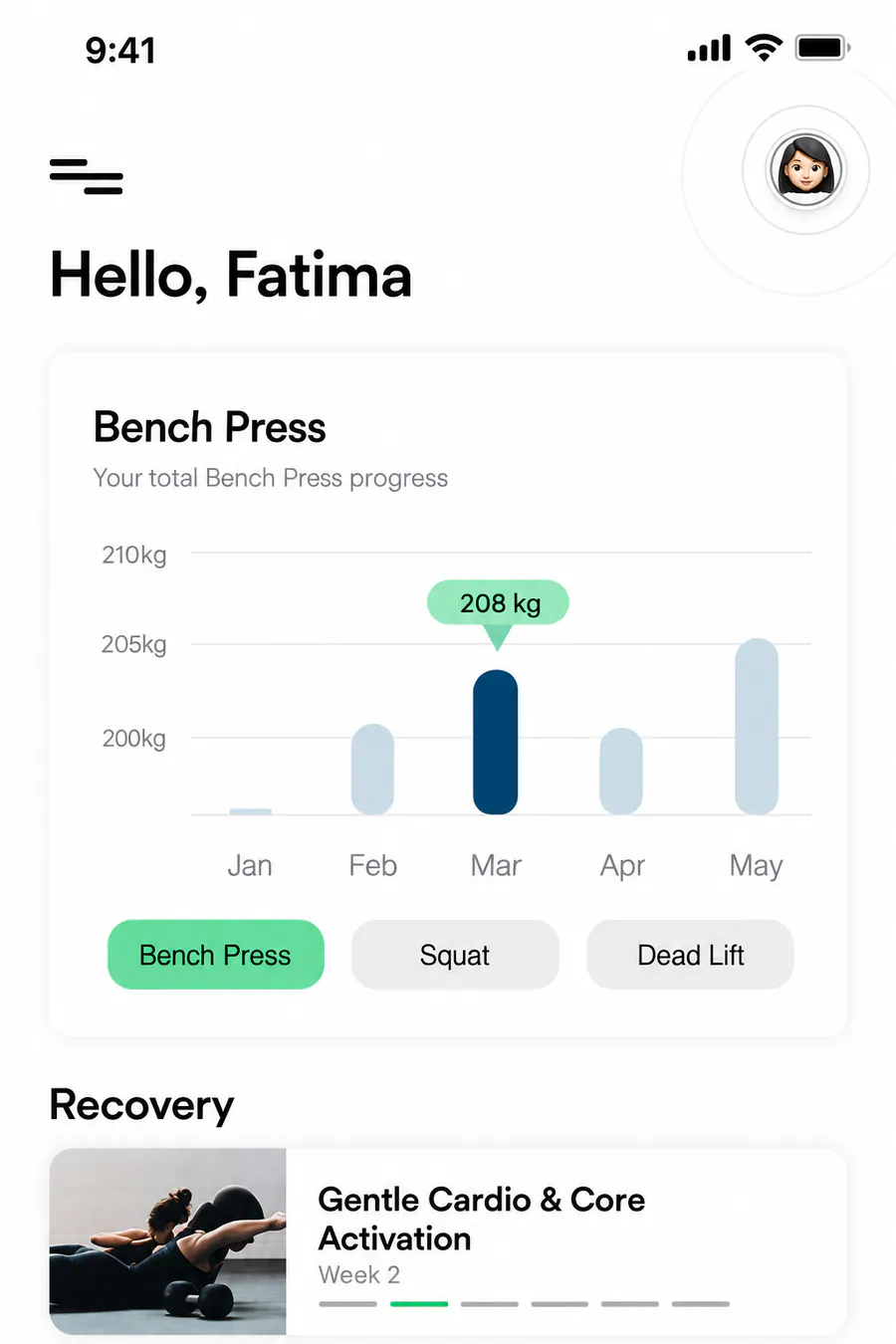
The low-fidelity screens established the hierarchy and core content. During design development, I kept that structure and introduced clearer emphasis, meaningful imagery and a consistent visual language. The result was an interface that felt easier to scan and understand.
Low-fidelity to high-fidelity comparison
02 / Principles in practice
The principles became interface decisions.
I applied usability principles as I refined each screen. Every decision had a practical purpose: simplify the information, clarify progress or provide guidance when it was needed.
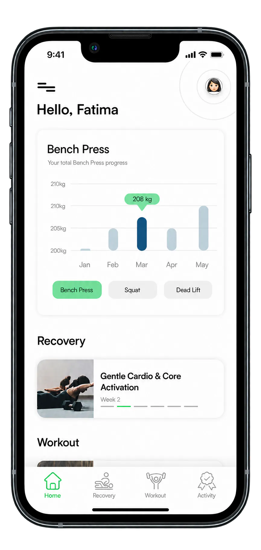
Minimalism
Reduce cognitive load
The focused home and recovery screens showed only what users needed for the immediate task, reducing visual overload while keeping progress and the next useful action clear.
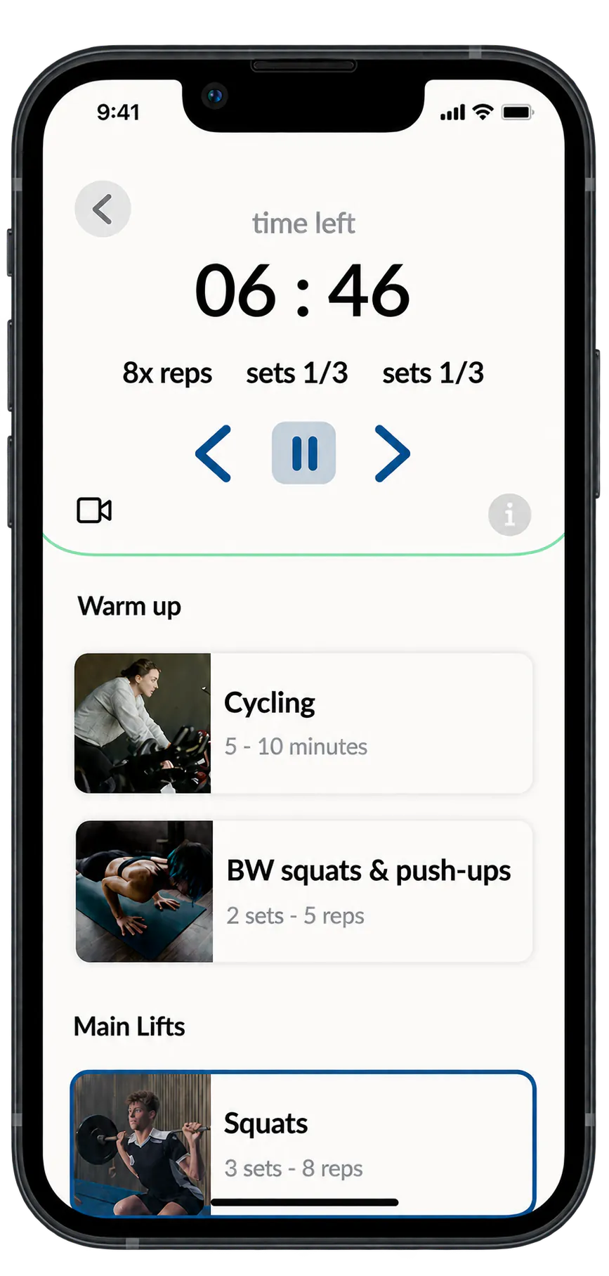
System status + consistency
Keep users oriented
Timers and progress indicators made multi-step states visible, while familiar labels, icons and repeated controls kept movement between workout steps predictable.
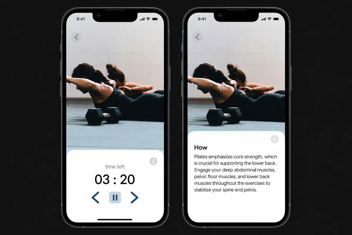
Contextual help
Support users in context
Optional guidance remained available inside the exercise experience when needed, without cluttering or interrupting the main task.
03 / Refinement through feedback
Feedback improved both clarity and inclusion.
The community layout changed in response to feedback, while configurable colour preferences extended accessibility thinking across the wider interface.
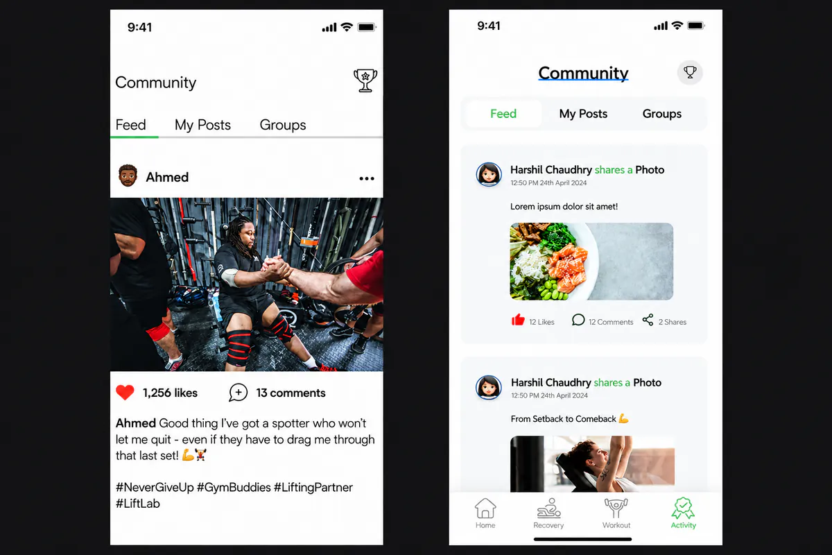
Feedback-led refinement
The community became more distinctly LiftLab.
The first high-fidelity feed felt too similar to Instagram. I returned to an earlier direction and refined the feed so the community experience better matched LiftLab’s own product structure.
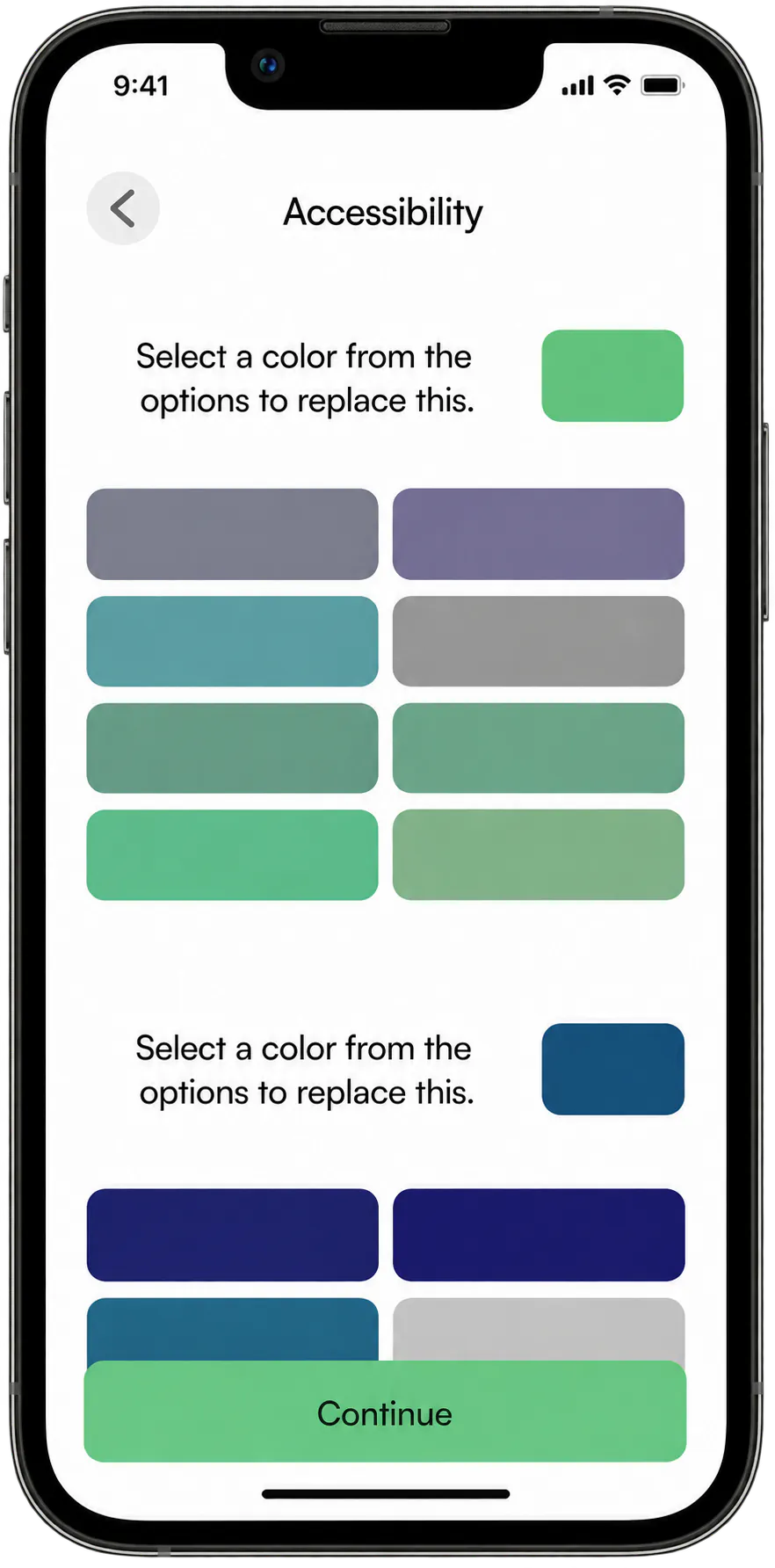
Accessibility choice
Colour preferences became configurable.
To support users with colour-vision differences, the interface offered primary and secondary colour choices they could distinguish more comfortably. The selected palette updated the wider app rather than one isolated screen.
04 / Final high-fidelity interface
Four connected experiences brought the product together.
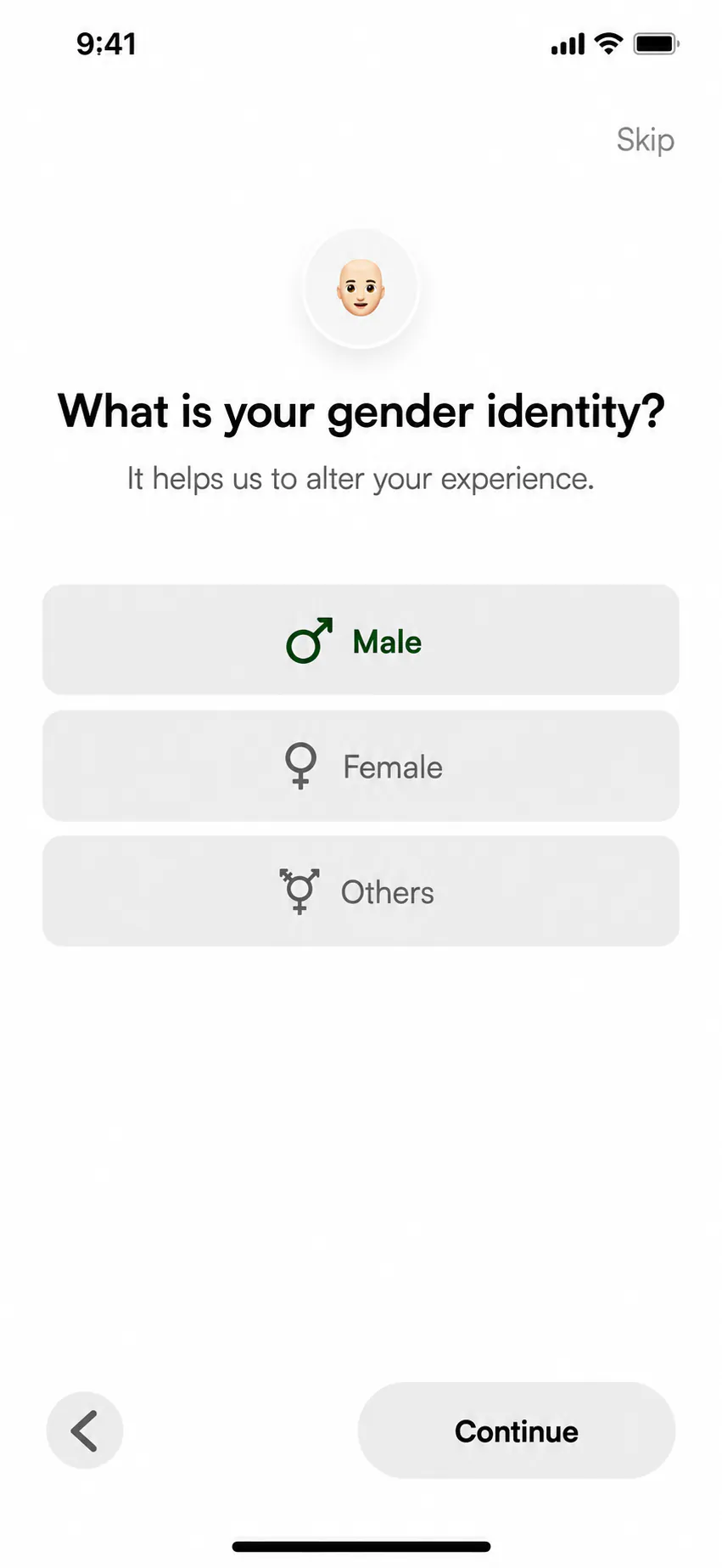
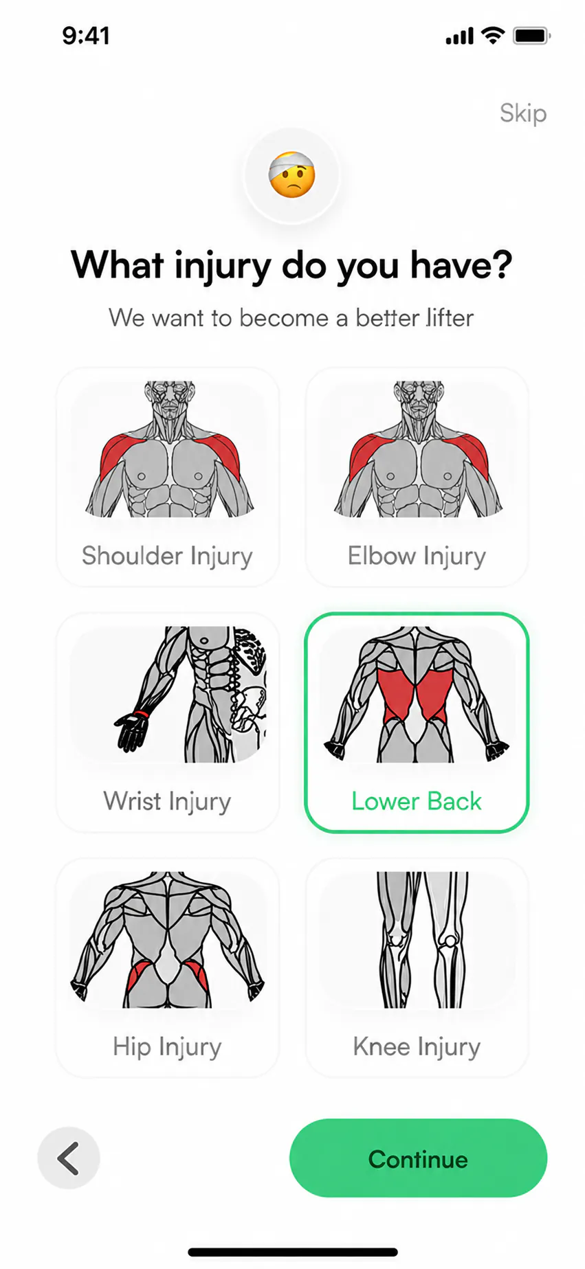
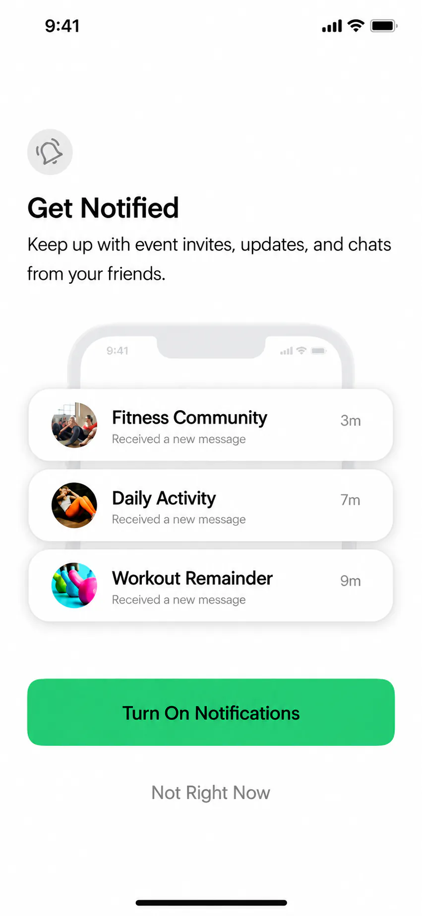
The final interface connected onboarding, progress-led home features, guided workouts and community. Each screen set appears in its own iPhone mockup, making the key flows easier to compare.
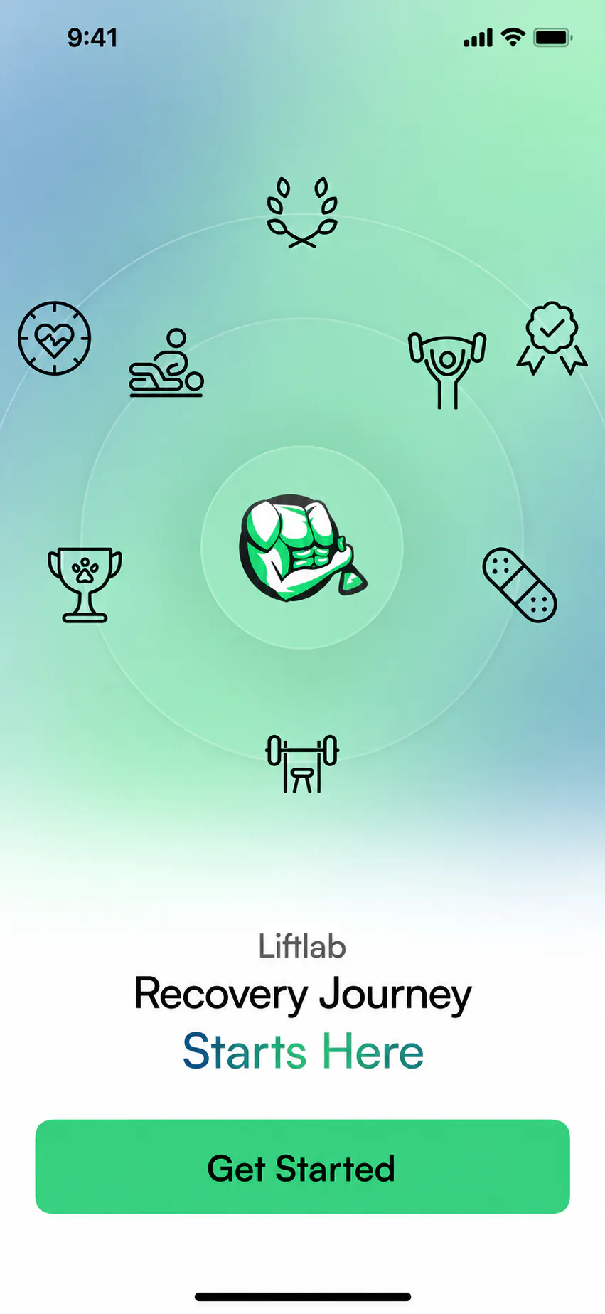
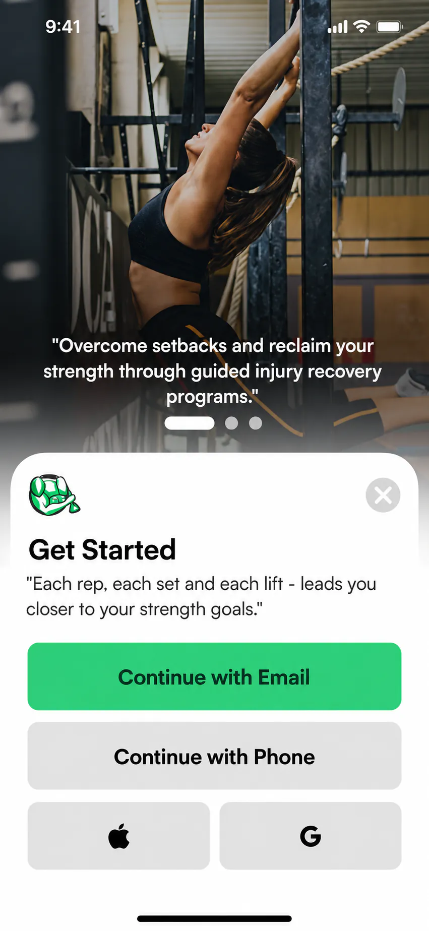
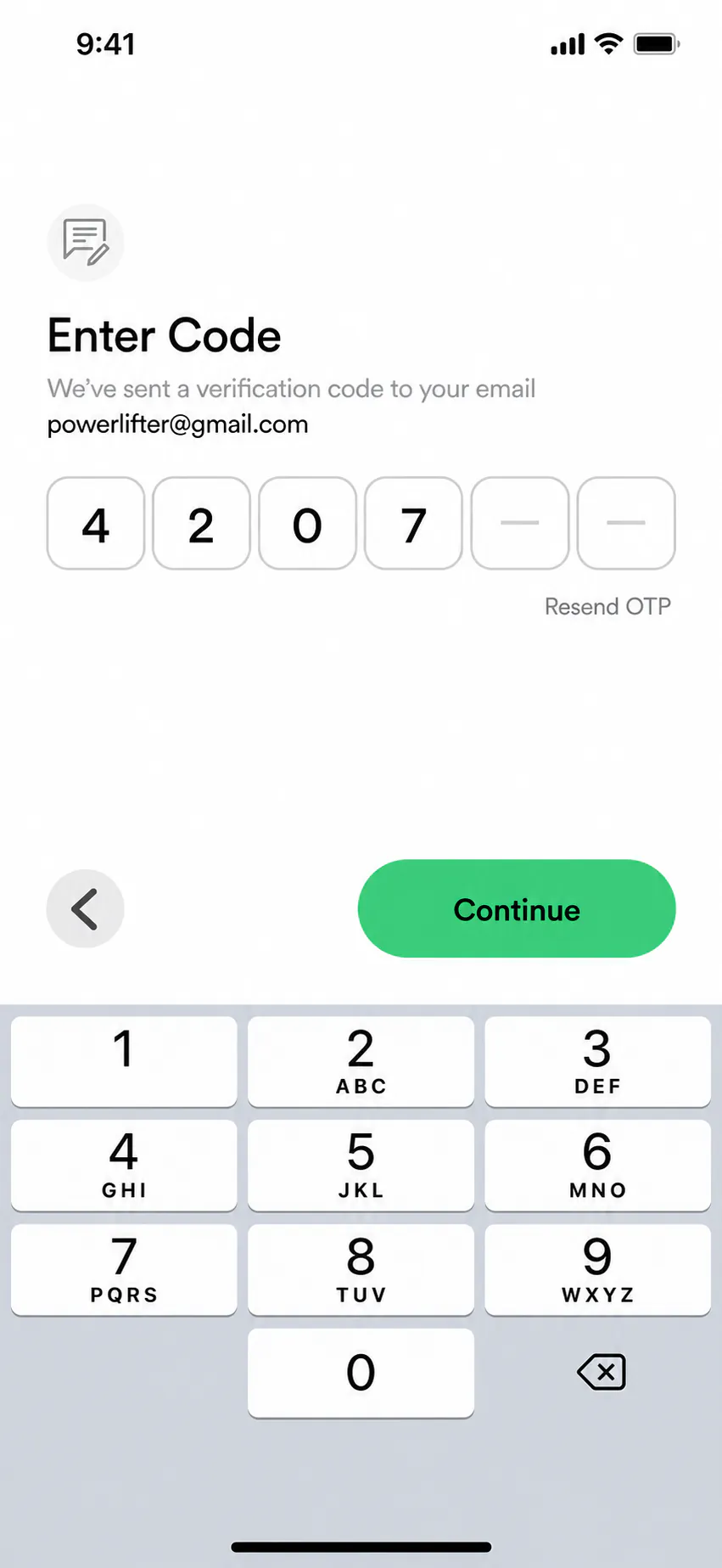
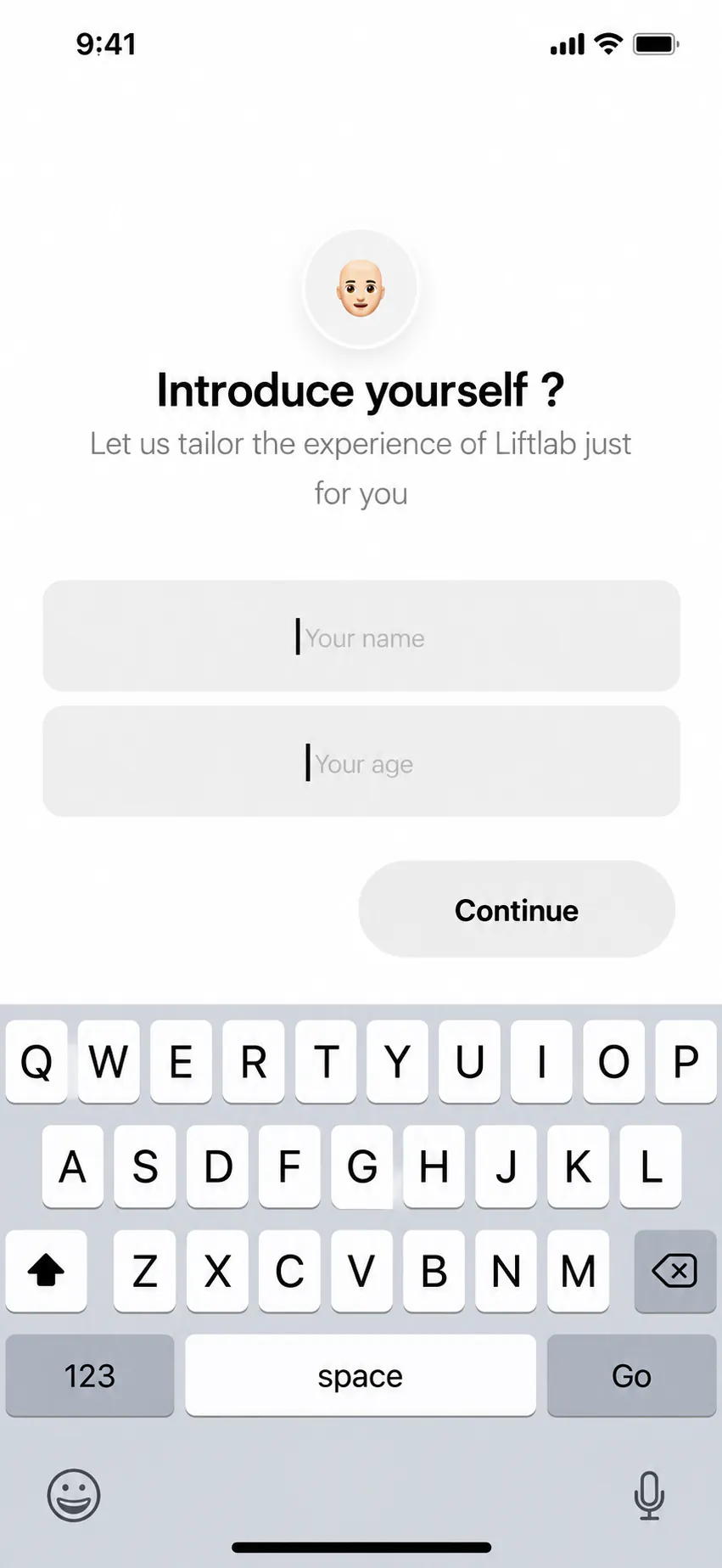
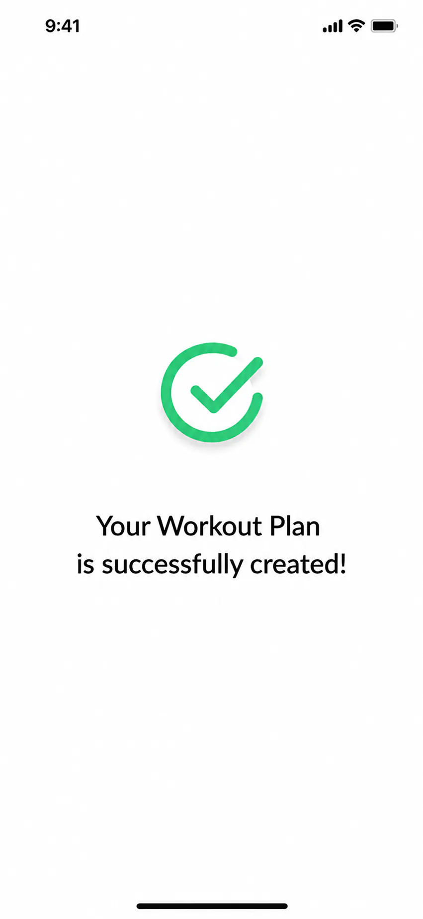
Start the recovery journey
A focused opening screen introduces LiftLab and gives users one clear action to begin.
1 / 12
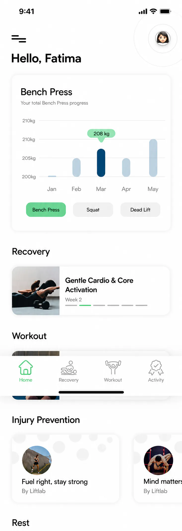
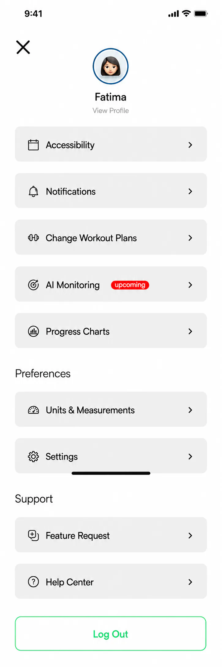
See progress at a glance
The home screen brings strength progress, recovery and useful next actions into one vertically browsable view.
1 / 2
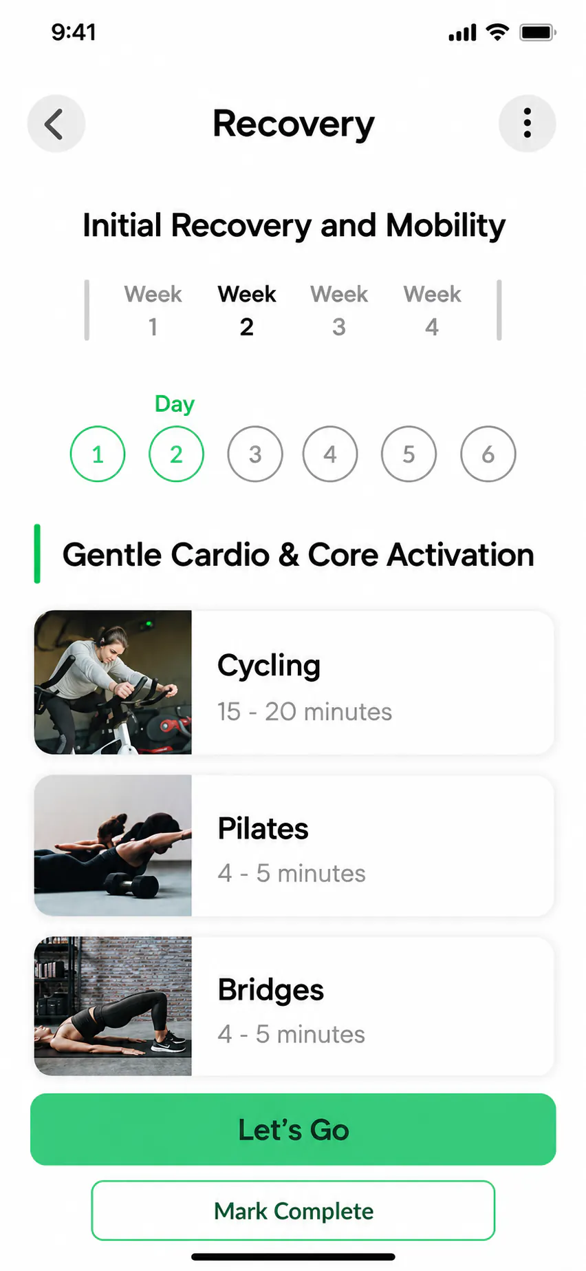
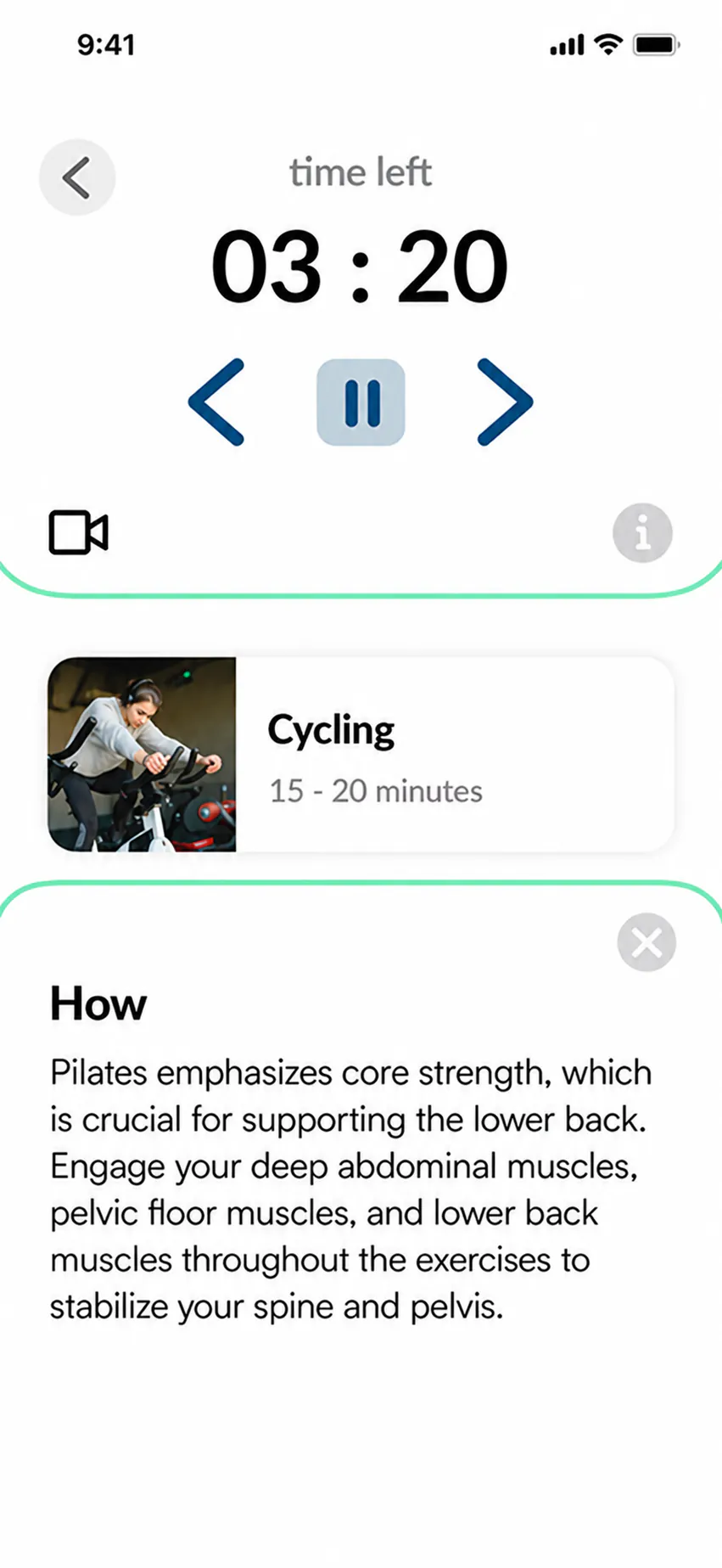
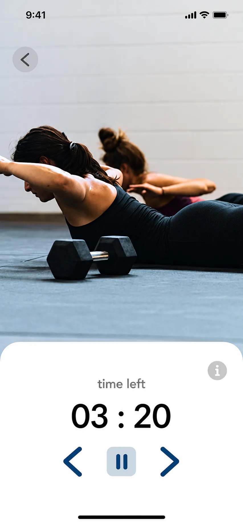
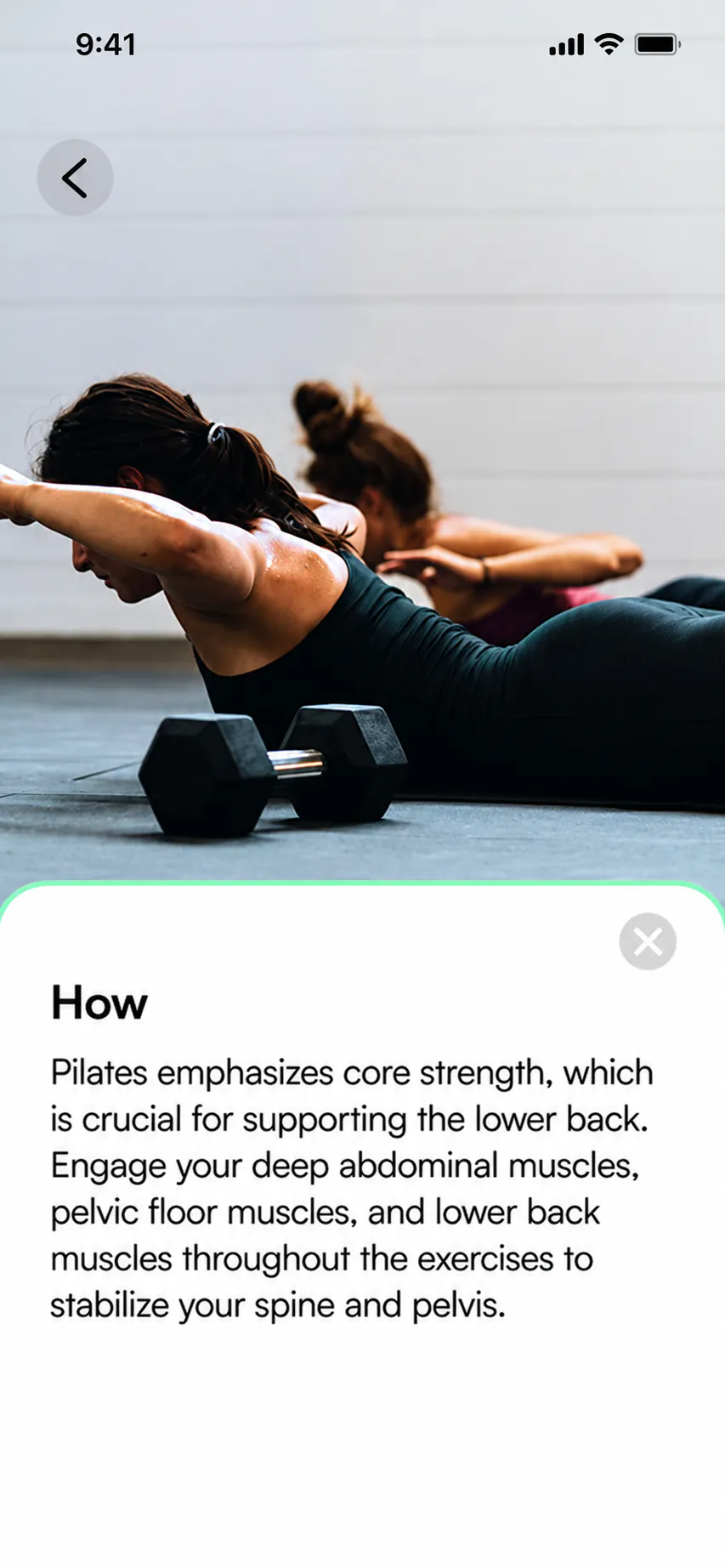
Review the recovery session
A structured overview keeps the current recovery week, training day and exercise sequence visible before the session begins.
1 / 4
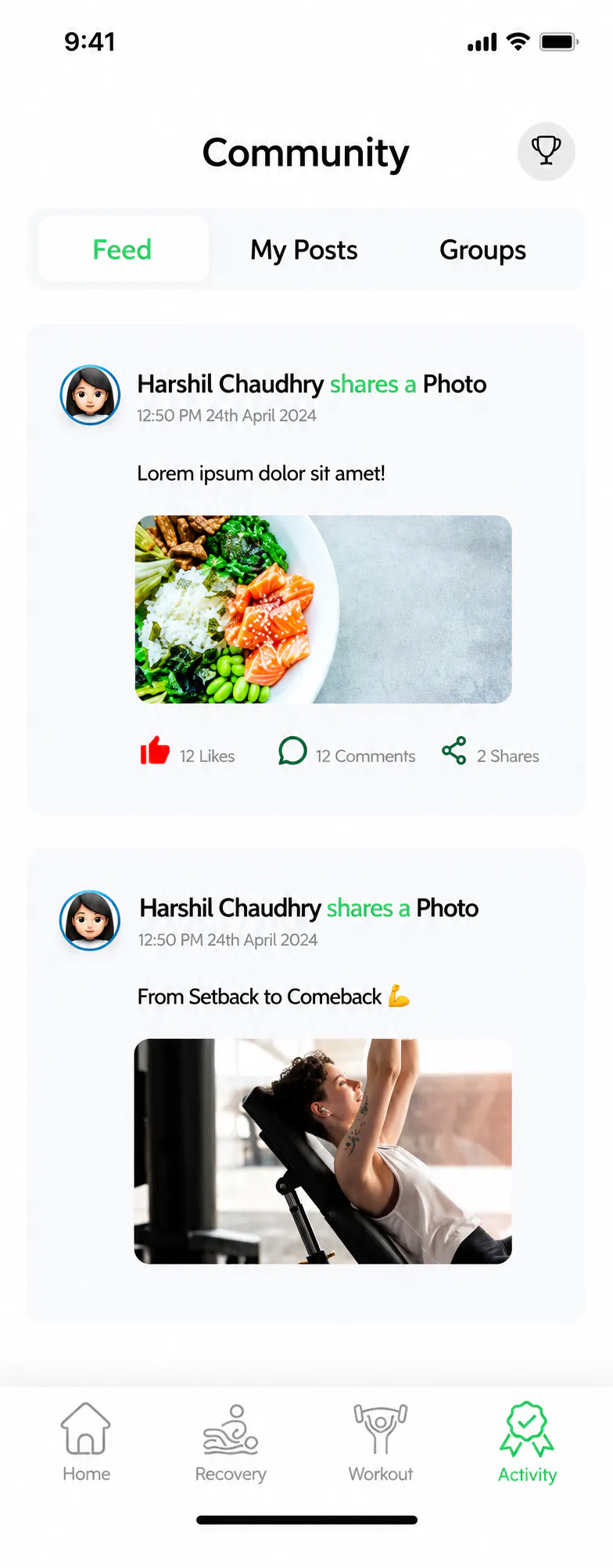
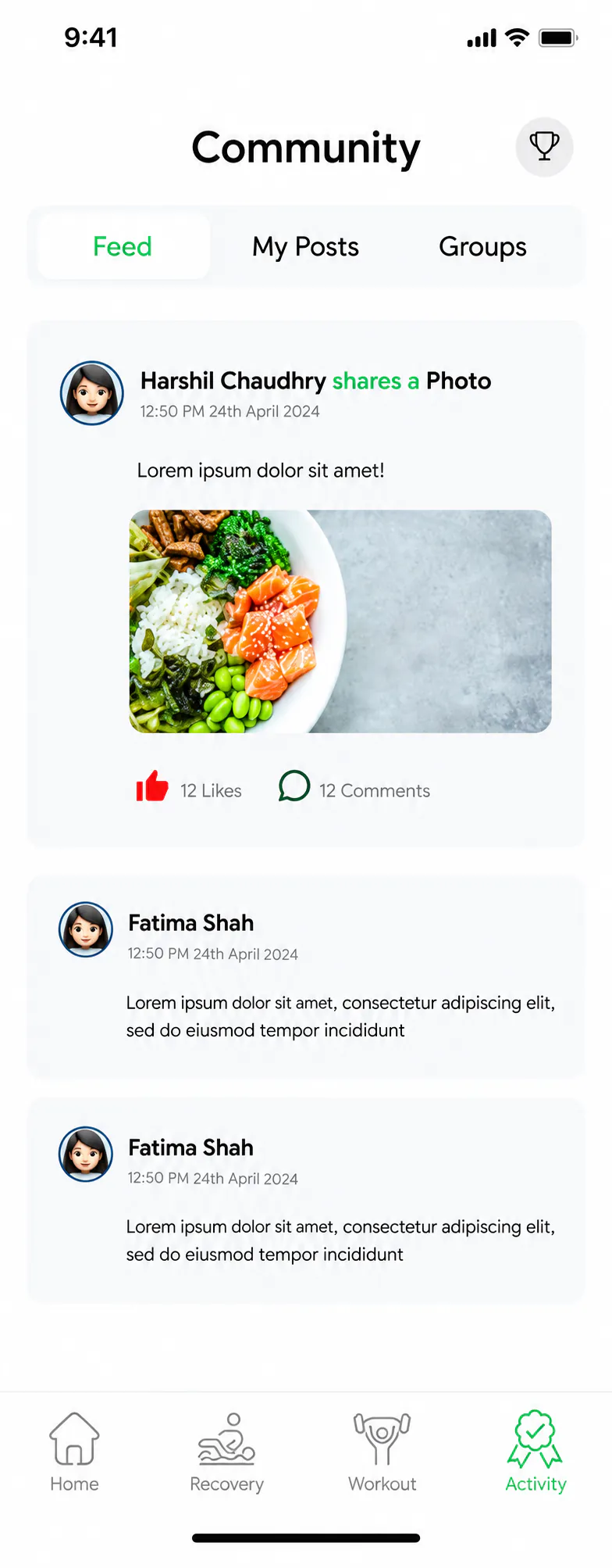
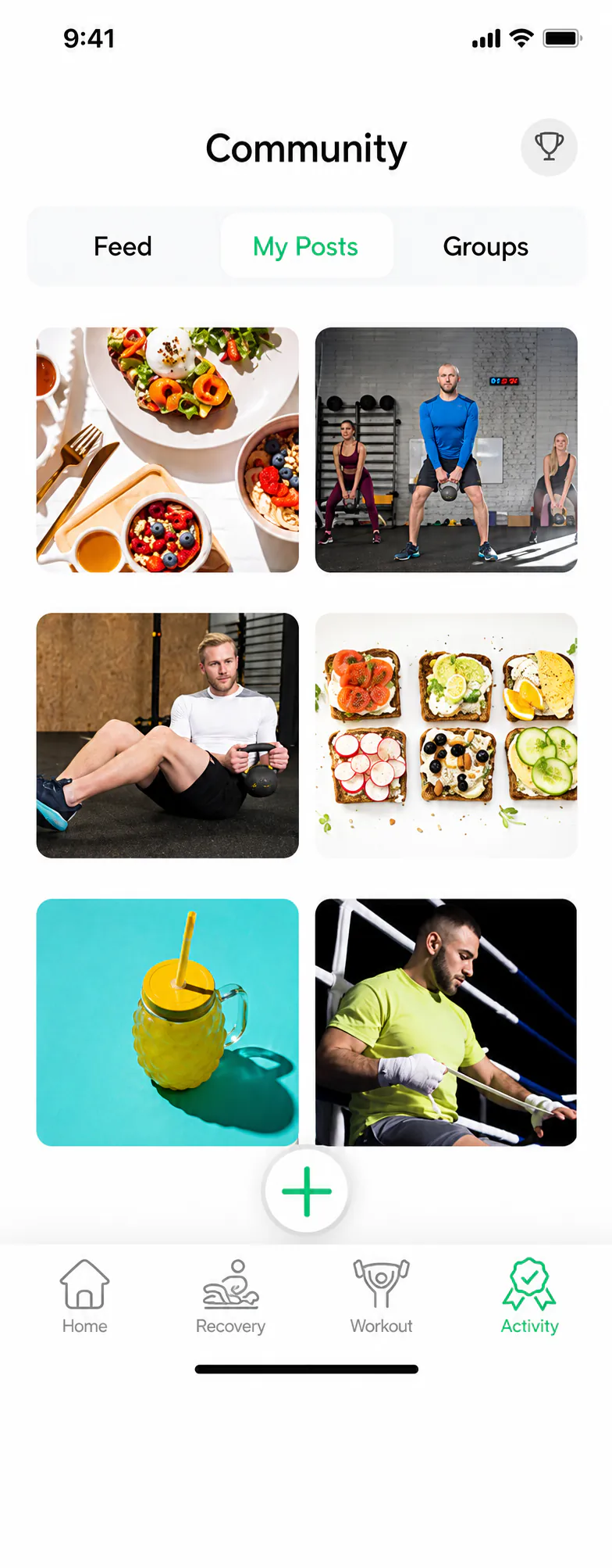
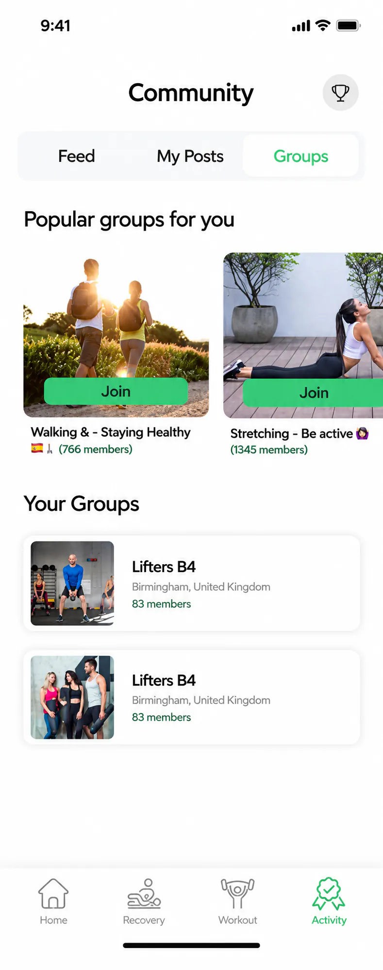
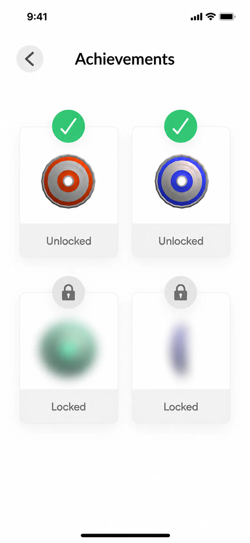
Browse the community feed
A shared feed brings member updates, photographs and lightweight social actions into one familiar view.
1 / 5
06 / Evaluation
The finished prototype was ready for pilot testing.
With the final product design in place, I moved into pilot evaluation to understand how clearly and consistently the experience worked. The review focused on whether people could follow the guidance, recognise system states, move between tasks efficiently and use the interface with confidence.
What the pilot considered
ClarityConsistencyGuidanceAccessibilityLearnabilityEfficiencyUser confidence
01 / SUS testing
A shared usability measure across three core flows.
Seven participants explored three representative prototype flows and then completed the 10-question System Usability Scale (SUS). Using the same measure after each session gave me a comparable usability score for the finished concept.
A small formative sample used to identify usability signals, not to make population-level claims.
Recovery, workout planning and community represented the product’s central experience.
Every participant completed the standard ten-item SUS questionnaire after the prototype tasks.
02 / Results
The average was 71.8, but individual scores varied.
Scores ranged from 62.5 to 95. Showing the distribution alongside the average keeps the strongest and weakest responses visible instead of allowing one number to flatten the result.
1007550250
03 / Reading the evidence
Useful evidence also has clear limits.
The result provides direction for another design cycle, but it does not validate every feature or prove any real-world health impact.
A testable, understandable concept
The core prototype journeys were usable enough to generate structured SUS responses and actionable feedback. That feedback also informed a traceable redesign of the community experience.
Effectiveness beyond the prototype
Seven responses cannot establish statistical significance, formal comparative performance, clinical validity, sustained behaviour change or real-world recovery outcomes.
04 / Next steps
Test real user behaviour.
A stronger evaluation would expand the participant group, observe task performance directly and review recovery content with qualified subject-matter experts.
Recruit beginners, experienced lifters and people returning from injury to compare needs across different levels of familiarity and confidence.
Record completion, errors, hesitation and time on task across the recovery, workout and community journeys.
Review health-related language and guidance with appropriately qualified professionals before any real-world trial.
Evaluation takeawayI could not claim that LiftLab was effective in the real world. I could show that the concept was understandable, testable and ready for a more rigorous next round.
End of case study